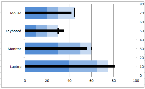
Bullet Chart in Excel
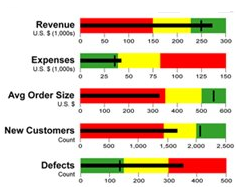 Bullet graph features a main measure, compares it to a target and displays the performance as Worst, Average and Best or Poor, Satisfactory and Good etc. Bullet graphs can be horizontal or vertical. Bullet charts are easy to read and understand. However, there is no easy way to create bullet charts in Excel. In other words, you cannot directly insert bullet charts in Excel unlike other types of charts.Bullet chart is a kind of charts in Excel which show values which are built-in other values. For example you can show here how are you going with your sales plans. It could looks hard to understand but example below will make it more clear.
How to Create a Bullet Size Chart?
Open Excel and save your file as bullet.xlsx. Enter details as in the following image.
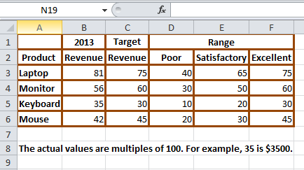
Select cells from B2 to F6 and go to Insert (main menu), Bar (in the Charts group) and select the first chart type from the 2-D Bar section (circled in red).
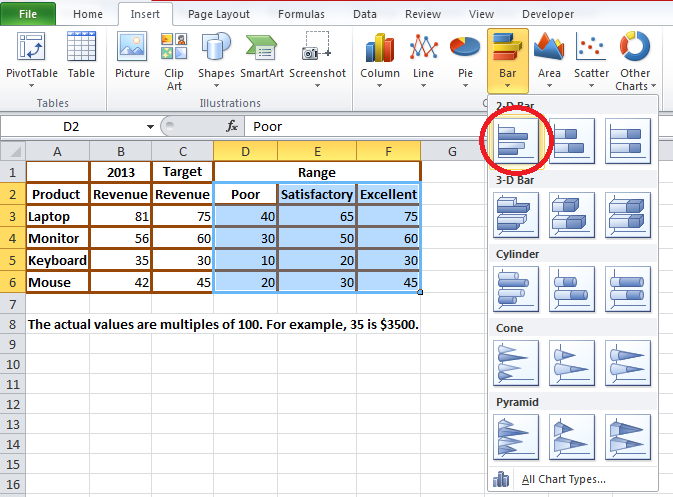
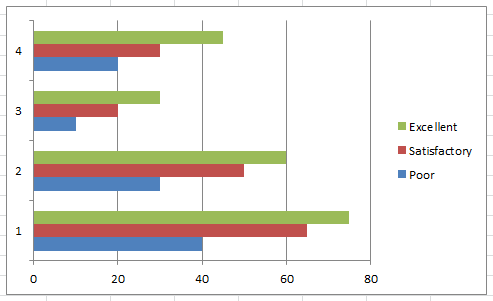
Now you will get a chart like this:
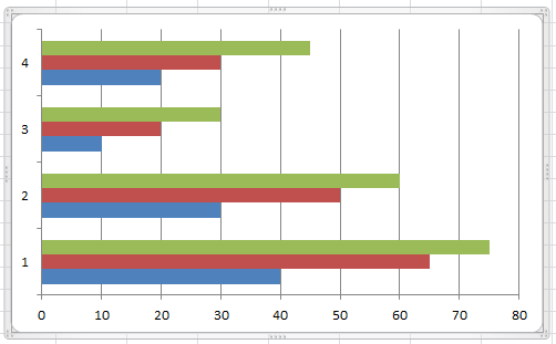
Select the legend (the section that contains Excellent, Satisfactory and Poor) and press the Delete button. Now your screen will look like this:
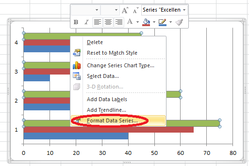
Right click any of the green bar and click Format Data Series option.
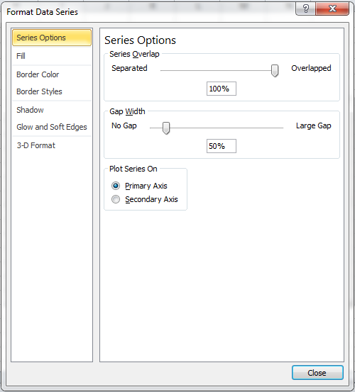
From the new window, select Series Options from the left. In the textbox under Series Overlap, enter 100% and in the textbox under Gap Width, enter 50%.
Click the Close button. Now your screen will look like this:
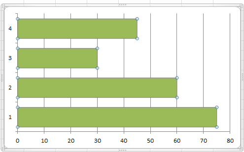
Right click any of the green bar and click Select Data option.
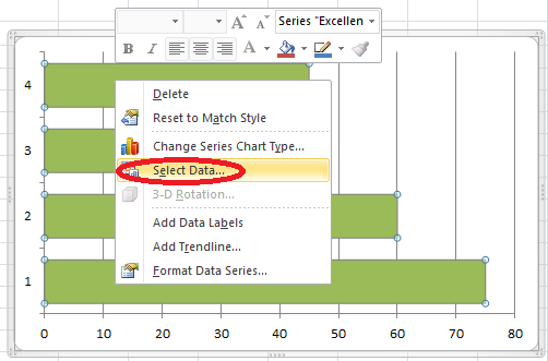
In the new window, click the item Excellent and using the up arrow move it upwards. Using the up and down arrows (next to Remove button) correctly, position the item Satisfactory in the middle and the item Poor in the last.
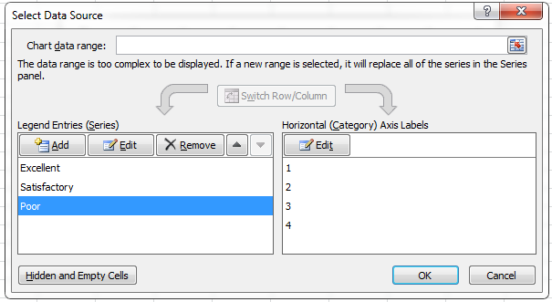
Select the Edit button below Horizontal (Category) Axis Labels to get a new window like this:
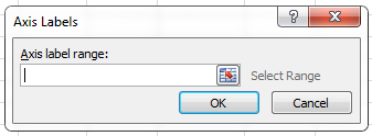
Click the spreadsheet icon and select cells from A3 to A6. Your window should look like this:

Click OK to get a window like this:
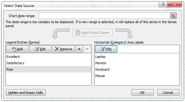
Again click OK and you will get a screen like this:
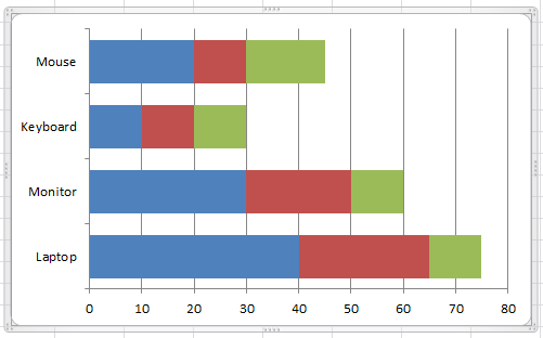
Right click the blue section and click Format Data Series option. Click Fill from the left and select Solid Fill from the right, and from the Color drop down select any dark color.
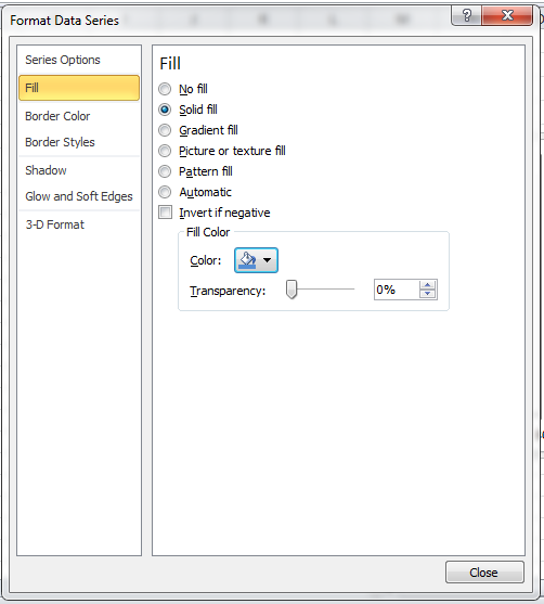
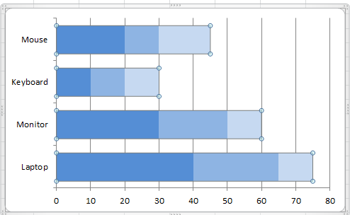
Click the Close button. Repeat the same for brown and green sections and choose lighter versions of the same dark color you selected previously. Now your chart will look like this (the color could be different).
Right click any of the blue bar and click Select Data. In the new window, click the Add button and you will get a new window. Click in the Series Name: textbox and click the cell B1. Click in the Series Values: textbox and select cells from B3 to B6. Now the window will look like this:
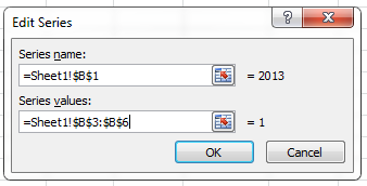
Click OK. Again click the Add button. Click in the Series Name: textbox and click the cell C1. Click in the Series Values: textbox and select cells from C3 to C6. Now the window will look like this:
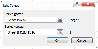
Click OK and again click OK.
Right click the blue section and click Change Series Chart Type option.
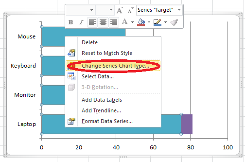
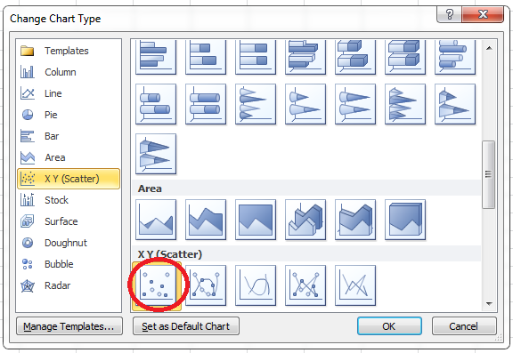
You will get a new window and select XY (Scatter) from the left hand side. From the right, select the first chart type below the XY (Scatter) section.
Your chart will look like this:
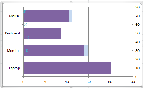
Select the purple section and repeat step 8. Now your chart will look like this:
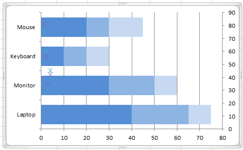
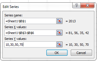
Right click any purple cross mark and click Select Data option. From the left, select 2013 and click Edit button. You will get a new window. Click in the Series name: textbox and click the cell B1. Click in the Series X values: textbox and select cells from B3 to B6. Enter the values 10,30,50,70 in the Series Y values: textbox. Now the window will look like this:
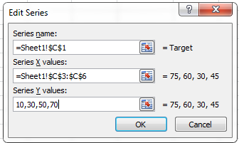
Click OK button. Select Target and click Edit button. Click in the Series name: textbox and click the cell C1. Click in the Series X values: textbox and select cells from C3 to C6. Enter the values 10,30,50,70 in the Series Y values: textbox. Now the window will look like this:
Click OK button and click OK button again. Now your screen will look like this:
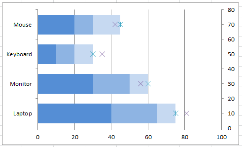
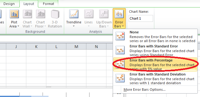
Click any of the blue cross mark and go to Layout (main menu), Error bars (from the Analysis group) and select Error Bars with Percentage.
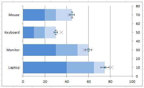
Now you will see a horizontal and vertical line over all the four blue cross marks like this:
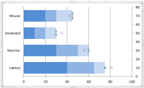
Select the horizontal line and delete it so that you will get a screen like this:
Go to Layout (main menu) and click the Chart Area dropdown (from Current Selection group).

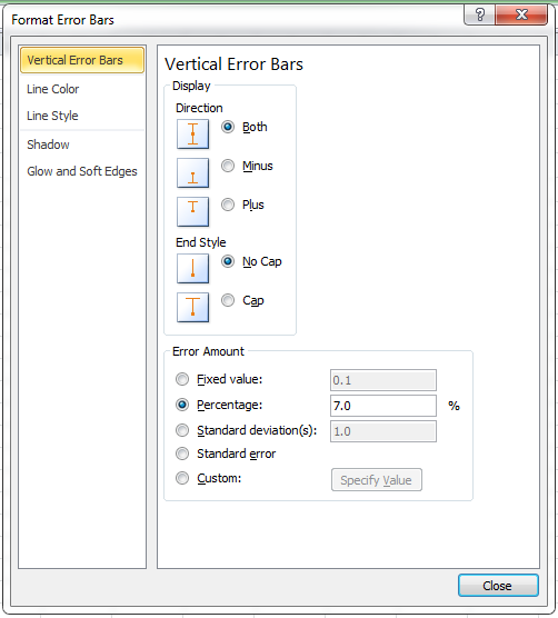
Select Series “Target ” Y Error Bars from the dropdown and click Format Selection just below the dropdown. You will get a new window. Select Vertical Error Bars from the left hand side. Select Both from the Direction section and No Cap from End Style section. Enter 7 in the Percentage textbox under Error Amount section. Now your screen will look like this:
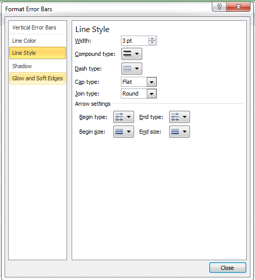
Select Line Style from left and enter 3 pt in the Width combo box. Now your screen will look like this:
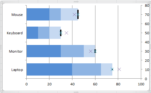
Click Close button to get a chart like this:
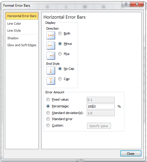
Click any purple cross mark and repeat steps 10 and 11. Delete the vertical line instead of horizontal line. Select Series “2013” X Error Bars from the dropdown and click Format Selection just below the dropdown. You will get a new window. Select Horizontal Error Bars from the left hand side. Select Minus from the Direction section and No Cap from End Style section. Enter 100 in the Percentage textbox under Error Amount section. Now your screen will look like this:
Select Line Style from left hand side and enter 6 pt in the Width combo box. Click Close button.
Right click any of the cross mark and click Format Data Series option. In the new window, select Marker Options from the left and click None from the right.
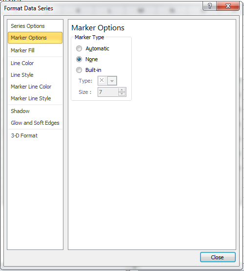
Click Close button and your bullet size chart is ready now.
