

Pivot Chart in Excel
Charts are an excellent tool to visualize the data attractively and more clearly. In Excel, we have various types of charts and Pivot Chart is one of them.
What is Pivot Chart?
Pivot Chart is an in-built programmed tool introduced to summarize your Pivot table data in an interactive dataset in the excel spreadsheet. It’s the visual representation of a pivot table in Excel, or in other words, you can say that the Pivot table and Pivot Charts are linked with each other.
A pivot chart is a useful tool, especially when the user is dealing with large amounts of data. For instance, an XYZ company has 200 employees. The HR has maintained each candidate’s working hours in Excel. Now they want to find the employee name who has taken the minimum leave in the entire year so you can reward him for his sincerity and devotion towards the company. If you manually browse through the entire list, it would be time-consuming or fetched results could also be inaccurate. Don’t worry, because Microsoft Excel has provided a built-in feature named “pivot table” or a “pivot chart” to cater to such tasks. Pivot Charts enable instant reorganization and understanding of your data visually, facilitating the complete process.
Note: Pivot table or Pivot Charts is an inbuilt tool of both MS Excel and MS Access. While in the case of Excel, the user can easily move the pivot chart by using the copy and paste feature within MS Excel worksheets or amongst other MS Office Software, whereas MS Access doesn’t allow the copy and paste of Pivot Charts.
Advantages of Pivot Charts
- Pivot charts are a powerful way of interpreting data pictorially.
- Pivot charts make the process of visualization of data effortless.
- Pivot Charts are widely used for Data Analysis.
- Pivot charts effectively facilitate various data conclusions and determine the basis of statistical calculations.
- Pivot Chars efficiently handle massive unsized raw data by correlating them through Pivot filtering and Pivot slicing.
Limitations of Pivot Charts
- Pivot Charts doesn’t allow you to create reports based on Multi-select / Checkbox field types.
- Whenever you insert a new field in an existing Pivot Table for which a Pivot Chart has already been created, Excel will automatically add the new field in the last column. It is impossible to change this order or make the added field (column) appear somewhere in the middle of the remaining columns.
Insert Pivot Chart
Follow the below given steps to insert a pivot chart in your Excel worksheet:
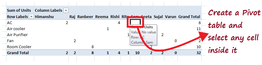
1. Select the cell where you want to insert the pivot table.
NOTE: Since Pivot table and Pivot Charts are linked with each other. In order to insert a pivot chart you need to insert a pivot table first.
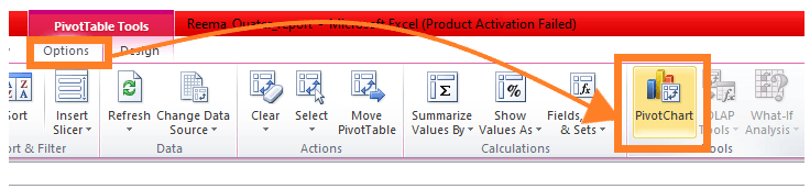
2. On the Excel ribbon tab, Options (or Analyze for newer versions) tab -> Tools Group -> PivotChart.
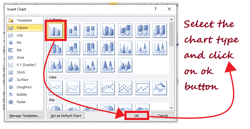
3. You will notice that the Insert Chart dialog box will open. Select the preferred chart type and click on the OK button.
4. As shown in the below image, based on the figures of your pivot table you will have your pivot chart. This pivot chart will feature your data visually in a more attractive way.
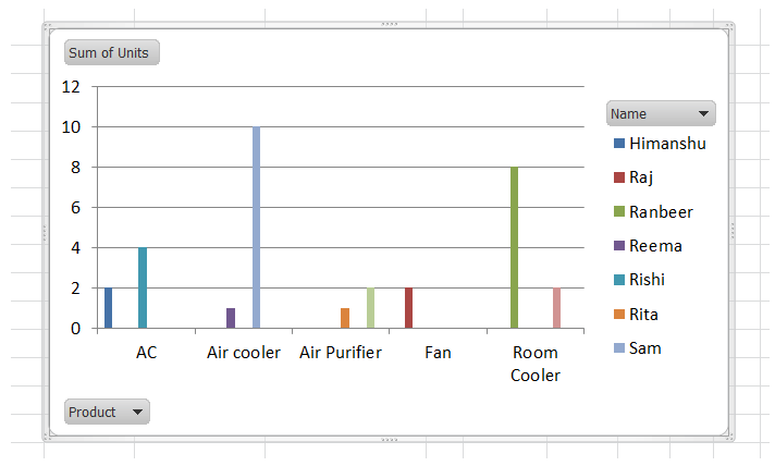
That’s it, with four different steps your pivot chart would be created. The above Pivot chart was just an example. Though you can create your own chart any data and can easily visualize and analyze it and even draw various future conclusions based on the analysis.
Note: If you make any amendments in the Pivot chart, it instantly reflects in your Pivot table and vice versa.
Filter Pivot Chart
The Pivot Chart filter option is widely used for data analysis and visualization. Users often use different filters in Pivot Chart using different conditions to analyze the specified data. For example, suppose a Pivot Chart displays the purchases of items in different countries, and you want to separate the purchase list of one specific country. In that case, filtering your Pivot chart is the best option for you.
Follow the below-given steps to insert a filter to your pivot chart:
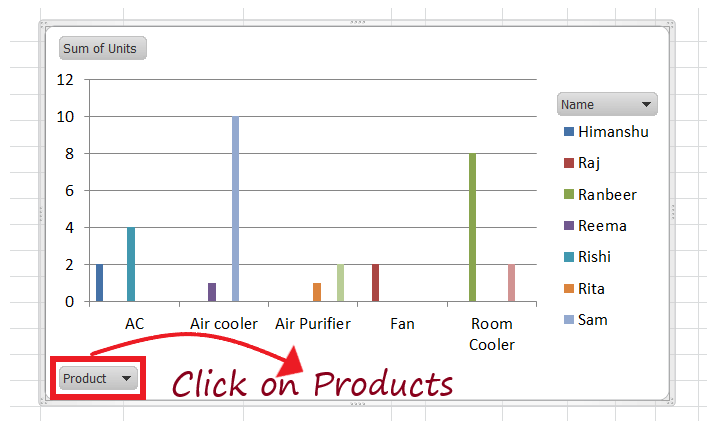
- You can only filter the fields used in your Pivot Table. As in our case, it Name and the Product fields. For example, we want to figure out the total unit sales for Air Cooler Products.
- Click on the Triangle icon next to Product.

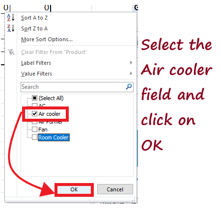
- The window will open. Now from the checklist, we will choose only the Air Cooler and remove the remaining. Click on ok.
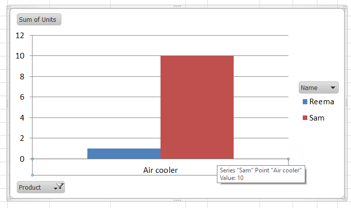
- Excel will immediately filter your Pivot Chart and will display the filtered result as shown below.
Change the Pivot Chart Type in Microsoft Excel
Microsoft Excel provides different types of Pivot Charts, so you can select any of them to represent your Pivot Table data visually. It helps to make the data analysis effective and visually more appealing. Therefore, understanding the process of creating and Filtering a Pivot Chart is as vital as selecting a precise Pivot Chart for data visualization. You can change the Pivot Chart type at any point of time in your Excel spreadsheet.
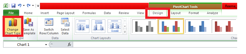
Follow the below-given steps to change the Pivot Chart Type in Microsoft Excel:
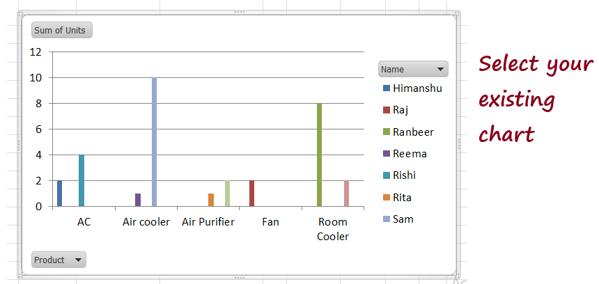
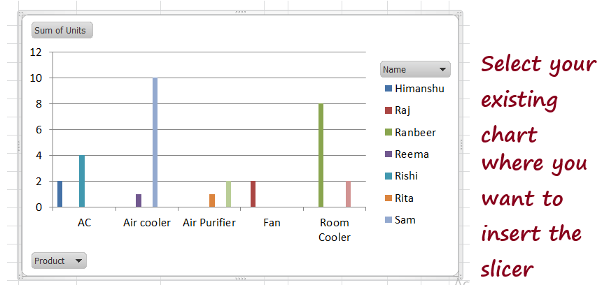
- Select your previously created Pivot chart.
- Go to Menu Bar -> Design tab -> Type -> Change Chart Type.
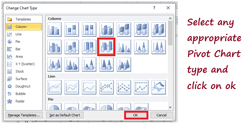
- The following window will open. Select the preferred chart type that you feel will help to represent your data more visually. Once done, click on the OK button.
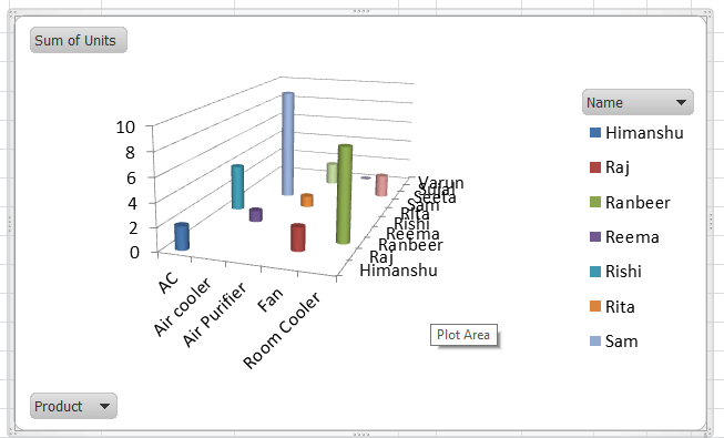
- Pivot Chart Type would be changed. As shown below excel will immediately replace the existing Pivot Chart with the newly selected type.
Inserting Slicer in MS Excel for filtering Pivot Tables
Slicers are an important feature of Pivot Table and Pivot Chart to change or filter them for effective data representation and analysis. One of the biggest advantages of Slicers is that they can be easily inserted in MS Excel by following some simple steps. Pivot Chart Filter and a Pivot Chart Slicer perform the same operation, giving the same output. You can use one of them at your convenience.
Follow the below-given steps to insert a slicer for filtering Pivot Charts:
- Select the cell where you want to insert the pivot table. Select the Pivot Table and insert the Pivot Chart.
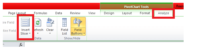
- From the Excel menu bar, click on Analyze and select the Insert slicer option from the Data group.
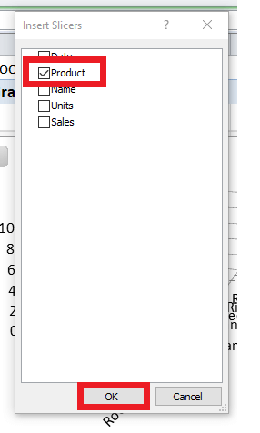
- Excel will throw the Slicer window showing all the field names. Select the fields where you want to apply the Slicer and click on OK.
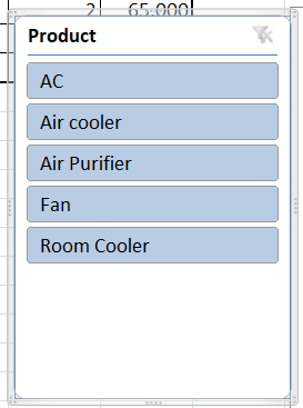
- The Slicer would be inserted though you can reposition the slicer window as per your preference.
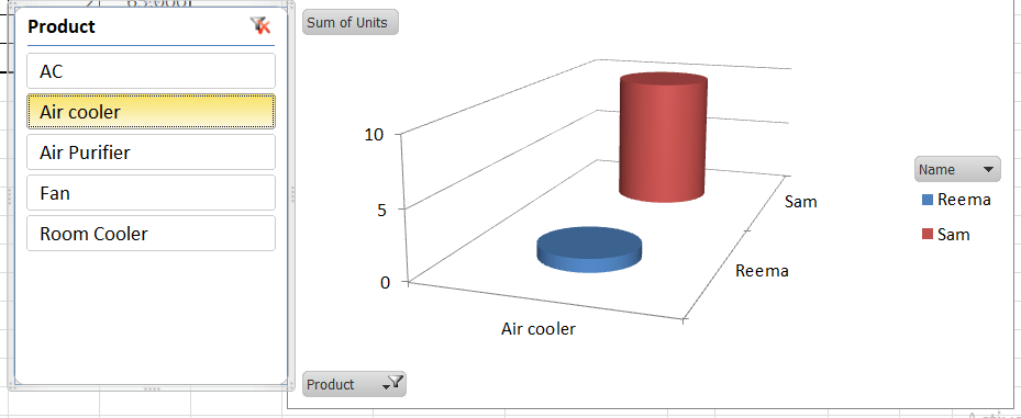
- Select any product from the slicer window, and you will notice that Excel will immediately recreate the Pivot Chart based on your selection. Unlike in the below image, we have selected the Air Cooler product, and we had its Pivot Chart representation.
Note: Though it takes a few more steps to insert a Slicer, it is easier to filter out the data and check the results instantly.


