Polar Chart in Excel
Polar chart is very useful in doing things like measuring vibrations in aircraft. It help to calculate and apply any necessary adjustments to the rotor, and help in making the data points to move as close to zero vibration (center) as possible. The polar chart is known as star chart, spider chart, star plot, irregular polygon, web chart, or kiviat diagram. The polar chart normally graphically shows the size of gap among 5 to 10 organizational performance areas. It also make the concentrations of weaknesses and strengths visualization. Further, it displays clearly the important categories of the performance. If it has been properly created, it also define the full performance in each of the categories.
Lay and Design your Data
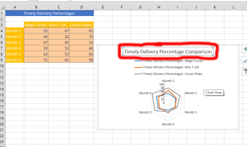
You’d need to lay out your data. The data should be similar to what has been displayed in the picture showing above. It is also important to make sure that the data is corresponding with what you would like to address.
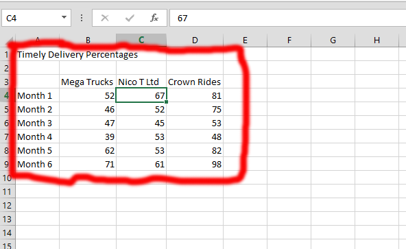
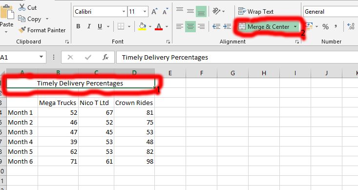
You should marked the title, which in this case is the “timely delivery percentages” and make sure that the size of the columns were adjusted with the help of clicking on the (A, B C, etc.) as the one showing right above the number 1 (marked in red), and right on the straight line stretch the size of the column. Then, you should go to the Merge & Center that is found on the Home tab of the Microsoft Excel. Click on it, and click on the Merge & Center that shows once you click on the one marked number 2.
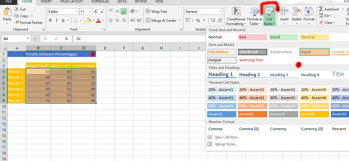
When you have made the previous step you could now mark the title and you would have chosen the merged column. You should click on it, (it is marked as number 1 in the pic), and then click on the Cell Styles (marked as number 2 in the pic), and choose the color in the one labeled as number 3. In this case, accent 5 was chosen for the title. You should now marked the title and time. You could do this by marking the columns that have to do with the parts you want to mark. In this case, we have chosen the months using the SHIFT key, and the CTRL key while chosen on the title area, and continue to select the columns that include the title with SHIFT. Then do the same on the value data, and choose a color for it. Make it look like it is in pic showing below.
Polar Chart Creation
Click on the table (number 1), and then click on INSERT (number 2). Then you would click on the Recommended chart, which is marked as number 3. Further, you should click on all chart, which is marked as number 4. Once you’d see the number 4, you should choose the Radar (number 5), and finally choose the kind of chart you would like, which is the number 6, and finally choose the one you would like to have, and click on Ok.
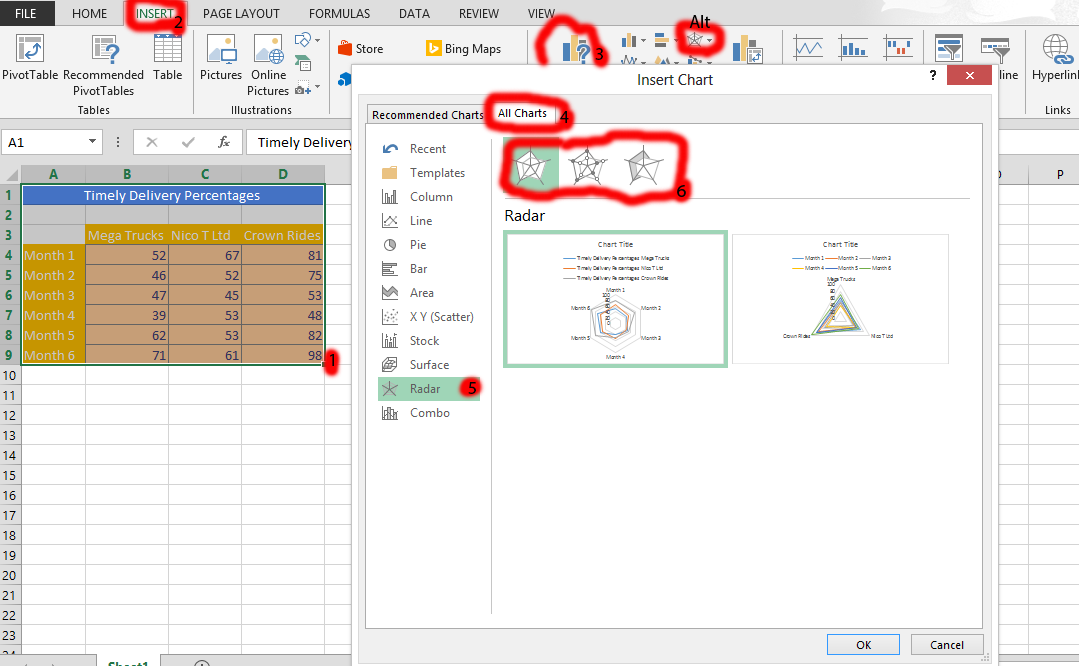
Tips: You could just use the one marked in red, and labeled as Alt in the picture above to create the polar chart.
You click on the title chart, and type in the title of the chart you have created. That is it, you have your polar chart ready.
