Probability Chart in Excel
 Click on home tab.
Click on a value in the data, and Sort & filter to choose Sort from smallest to largest.

Start another column, with one in between, and label it i.

Start another column, and label it formula.

Click on D2 (1), and type
=(C2-0,375)/(6+0,25)(2), and enter

Double click on the small square in the right bottom corner of the cell.

Label Column B Expected.

Click on B2 (1), and type
=NORM.S.INV(D2) (2)

Double click on the small square showing in the result from previous step.

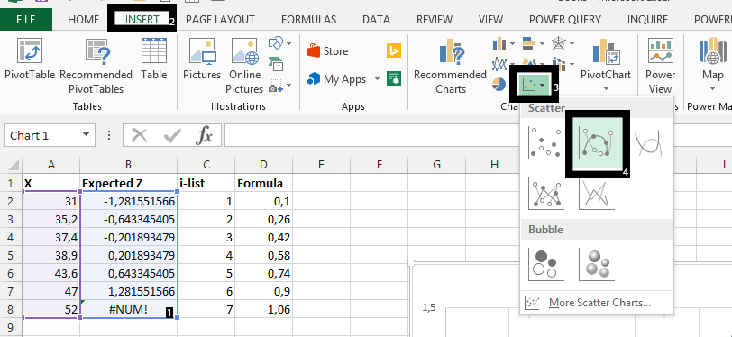
Highlight A2-B8 (1), click on insert (2), scatter chart (3), and choose desired chart (4) to plot normal distribution chart.

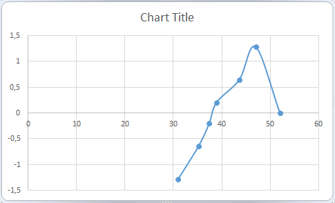
The Probability Chart is ready:

In conclusion, in the picture above, you see #NUM! This means the formula in D8 is above 1, and therefore not possible to be part of the probability.
Template
Further reading:
Basic concepts
Getting started with Excel
Cell References


