How To Insert Waterfall Chart In Excel
What is Waterfall Chart?
Waterfall chart is interesting example of a chart in Excel where you can see the effect of positive and negative data affecting result (in most cases net profit).
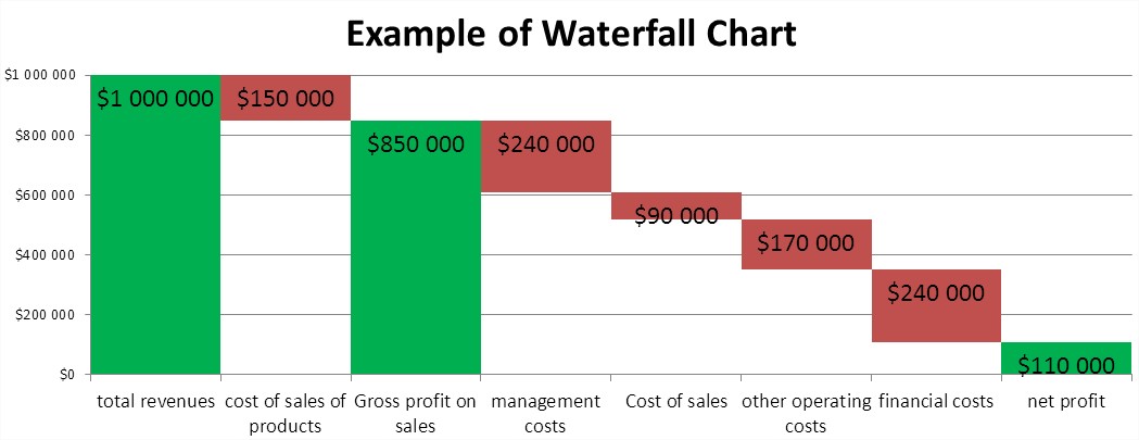
This is a very effective and quite simple to do in Excel chart type. Waterfall chart can be used for example to show the revenue and expenditure of personal or business. A more ambitious application is to show the profit and loss business. Simpler to display their own income and expenditure in the monthly budget. You do of course more difficult example.
The waterfall chart will show the individual components of the profit and loss (simplified). Subsequently we consider:
- total revenues,
- cost of sales of products,
- Gross profit on sales,
- management costs,
- Cost of sales,
- other operating costs,
- financial costs,
- net profit.
How to insert Waterfall Chart in Excel?
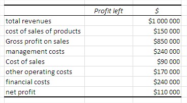
Start with the data. Create a table with sample amounts of revenues, expenses and net profit calculation. (Table formatted like an accountant.)
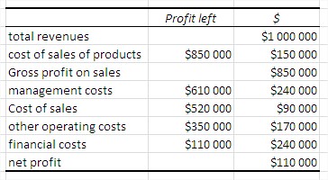
In the second column, enter the calculated residual profit. It is through the remainder of the profit rise, “waterfall” on the chart. For example, the remaining profit for the financial cost is the sum of financial cost and the cells below, or net profit.
Now create a stacked column chart. Legend will not be needed, so remove it immediately.
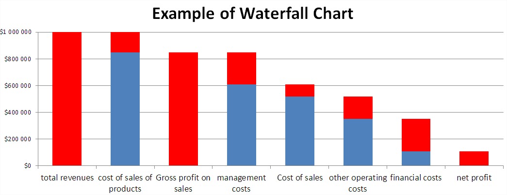
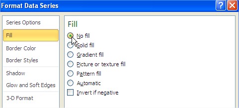
For now, the chart does not look such a waterfall. To change this, click on one of the blue columns (Excel ticks all) and format the column. A dialog box appears, where select ‘No fill’.
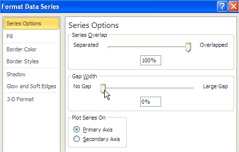
To look like a waterfall chart on the same dialog box in the ‘Series Options’ tick ‘Gap Width’ 0% (‘No Gap’).
For even more attractive graph format the column revenue and profits by setting fill in green.
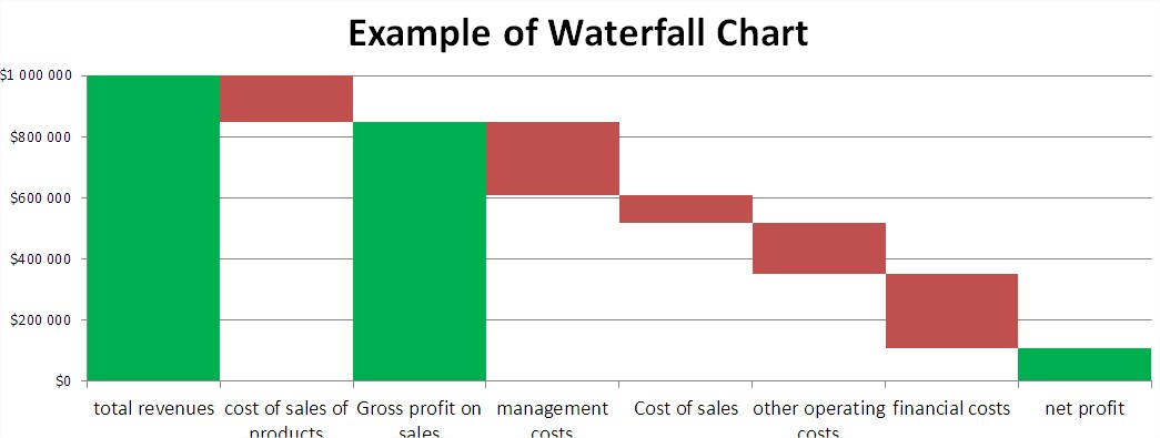
Just a few trinkets and a graph will be ready. Add data labels, and change the scale on the axis of the chart.

Waterfall chart is ready. It is true that interesting? It looks completely different than the commonly used types of charts and it is very readable. Same way the waterfall chart can be also use to illustrate your monthly budget.
Template
Further reading:
Basic concepts
Getting started with Excel
Cell References


