Bubble Chart Excel
Data visualization is an effective feature in MS Excel. Using this feature, we can customize the worksheet data using shapes, colours, styles, and other formatting styles or even create different charts/ graphs. A bubble Chart is one distinct type of chart in Excel, and it is more than just making dots like graphics and has real-life applications like the other charts in Excel.

In this article, we discuss the brief introduction of the Bubble Chart in Excel and the process of inserting or creating it within the Excel sheet. The article discusses the step by step process with relevant images and examples.
What is a Bubble Chart in Excel?
A Bubble Chart is a typical variation of a Scatter Chart in MS Excel. In Scatter Charts, we get data points on the plot area to display or visualize values and comparisons. However, the Bubble Chart uses bubbles in place of the data points, as its name suggests. Like the Scatter Charts, Bubble Charts also help display data comparisons on both horizontal and vertical axes.
When plotting the Bubble Chart, the data points with higher values form bigger bubbles and are displayed on the top of the chart. Besides, the data points with lower values form small bubbles and are displayed on the bottom area near the Y-axis. The Bubble Chart option is present in Excel 2010 and other higher versions.
This type of advanced Scatter Chart is typically used to represent three sets of data graphically. Using the Bubble Charts, we can display relationships between different datasets, and they are quite helpful while plotting the population data or regional capacity data. The Bubble Charts are most commonly used to plot financial data in business, social, economic and many other fields to understand the relationship of data.
Note: A Bubble Chart must be supplied with at least three variables (columns) of data, and the data must contain three numerical columns of data. One represents the size of the bubbles, and the other two represent the horizontal and the vertical axis or position of the points.
Types of Bubble Charts
Bubble charts have several distinct applications in different analytical fields, including mathematics and statistics. Due to their wide applications or uses, different types of Bubble Charts are present in Excel to help us plot data in each field accordingly.
The following list displays the different variants of Bubble Chart present in Excel:
- Simple Bubble Chart
- Labeled Bubble Chart
- Multivariable Bubble Chart
- Map Bubble Chart
- 3D Bubble Chart
Let us discuss each type in detail:
Simple Bubble Chart
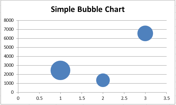
The Simple Bubble Chart is the basic version or the original version of the Bubble Chart with default settings. It is not the kind of Bubble Chart. Instead, it is the Bubble Chart itself. In a simple Bubble Chart, the data points are represented as bubbles. It does not use category axes. This means that both the horizontal and vertical axes are value axes in the Simple Bubble Chart. However, the Bubble Chart usually contains x, y, and z values (for bubble size). It is mostly used for analyzing patterns and trends in data.
Labeled Bubble Chart
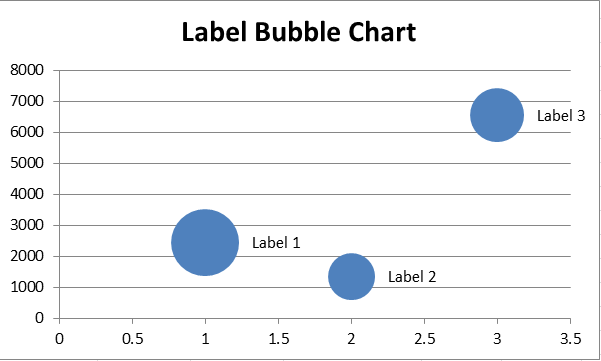
The Labeled Bubble Chart is almost similar to a Simple Bubble Chart; however, the Labeled Bubble Chart has a little variation. The Labeled Bubble Chart uses labels on bubbles as the substitutes for legends, and the labels typically help identify the variable the corresponding bubble represents.
The Labeled Bubble Chart is practically helpful only in scenarios when dealing with comparatively fewer numbers of data points. If we try to put labels on several data points, it becomes time-consuming. Moreover, having so many labels within the plot area makes the chart cluttered and difficult to understand.
Multivariable Bubble Chart
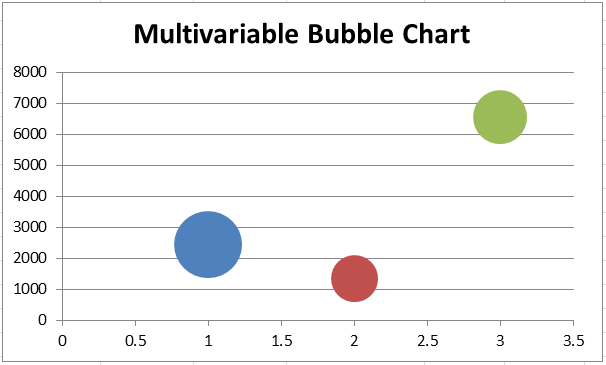
The Multivariable Bubble Chart is mainly used to deal with multiple variables in data, especially for dealing with more than three variables. This type of Bubble chart uses different colours to highlight different variable groups. The above two Bubble Charts typically form or visualize the supplied data only in one colour. However, the Multivariable Bubble Chart visualizes different groups of variables with the help of colours by default.
Map Bubble Chart
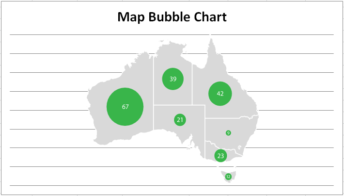
The Map Bubble Chart is a special type of Bubble Chart. This type of chart/ graph is typically plotted on the map. It is mostly used in geographical sciences, and thereby, is also known as ‘cartogram’. The Map Bubble Chart helps represent geographical locations on the map using the bubbles. With the Bubble Map or Bubble Map Chart, bubbles (circles or spheres) are plotted over a specific geographical region with the area of the bubble proportional to its value in a supplied dataset.
Map Bubble Chart is considered best for comparing geographic regions over a map without the issue of the specific size of the region. However, one disadvantage of using this type of Bubble Chart is that the bubbles can overlap or hide regions on the map.
3D Bubble Chart
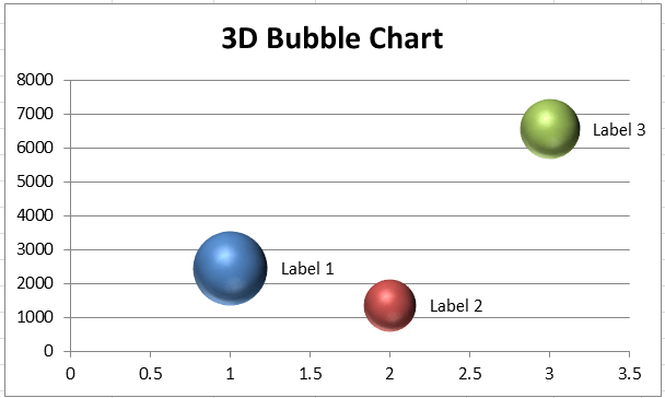
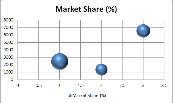
When we typically create a basic Bubble Chart in an Excel sheet, it is plotted in 2D format. However, we can change it to a 3D format using a 3D effect. Excel also has a 3-dimensional version of the Bubble Chart. Using 3D Bubble Chart, the bubbles plotted in the chart are no longer having a circular shape. Instead, the 3D Bubble Chart has sphere-like bubbles.
The radius of spheres in a Bubble Chart is calculated or drawn based on the third parameter supplied within the dataset. The 3d Bubble Chart can include all the above types of Bubble charts. However, it is not recommended to use this type when we have many bubbles. This can affect the overall appearance of the chart and can even be too difficult to understand or study sometimes.
Uses of Bubble Chart
Sometimes, there may be cases when we might need to use multiple bar charts to show results effectively. Instead of plotting multiple bar charts, it can be a good idea to create a bubble chart. The Bubble Chart is a simple, easy-to-use chart and effectively displays three types of quantitative data sets.
Although there can be an innumerable number of uses of Bubble Chart in Excel, some of the most common are as follows:
Search Engine Marketing
The Bubble Charts can help analyze the effect of High CPC rates on specified ad placements, clicks, and website conversions. The bubbles plotted on the chart will also display significant improvements over time when supplied with real-time data.
Keyword Density
When working on a keywords graph, the Bubble Chart can help determine the density of specific keywords. The bubbles plotted on a chart will display the most searched or least searched keywords based on the space the bubbles are occupying on a chart.
Promotional Effect
Advertisers can use bubble charts to track the effectiveness of advertising and promotions. They can generate bubble charts for three variables: the number of ads created, the money spent on each ad, and the total revenue generated from the ads. The size of the bubbles will help them to analyze the impact of the ads.
Sales and Marketing
Like all data visualizations, bubble charts also quickly present a story or overall summarized results. Sales and marketing experts use bubble charts to display their sales insights rather than a list of bullet points or tables to describe the entire metric. Bubble charts consist of multiple data series spanning different periods through a single neat presentation. Thus, a chart on a slide tells the story of top-performing digital marketing campaigns that emphasize ROI from various online/offline segments.
How to create a Bubble Chart in Excel?
Creating a Bubble Chart is similar to plotting other types of charts in Excel. However, we must ensure that our data include the following:
- Three Values Per Data Point: We require three values for each bubble in a Bubble Chart. The values can be written in rows or columns within the sheet; however, they must be in a preceding order: x, y, and z.
- Multiple Data Series: Plotting multiple data series in Bubbles Charts is identical to plotting multiple data series in Scatter Charts. In Bubble Charts, we create multiple bubble series, while in Scatter Charts, we create multiple scatter series. Furthermore, the Scatter Charts only require x and y values. But, the Bubble Charts require x, y and z values.
If we have the above parameters in our data, we can use Bubble Chart and display our data in the form of bubbles.
Let us understand the step by step process of creating a Bubble Chart with the help of an example:
- First, we need to enter the data in an Excel sheet to plot a Bubble Chart. We must select/ highlight the entered data without the row/ column headings.
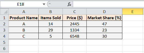
Let us consider the following table with some random sales.

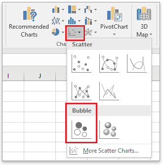
Since each series has at least three data, creating a Bubble Chart is a good choice. - We need to select a sheet to insert a Bubble Chart and then navigate to Insert > Scatter (X, Y) or Bubble Chart > Bubble.

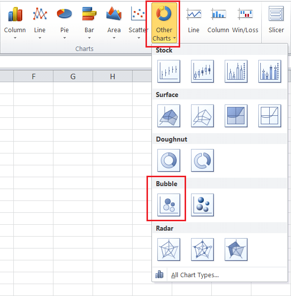
However, in Excel 2010, we must navigate to Insert > Other Charts > Bubble.

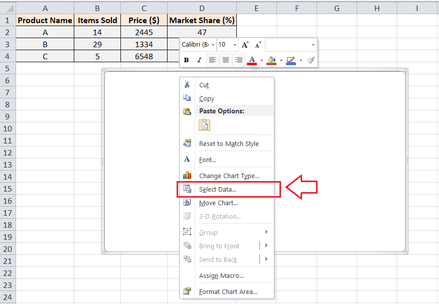
- After that, we will see an empty chart on a sheet. We need to right-click on the empty chart and click the option Select Data from the list, as shown below:

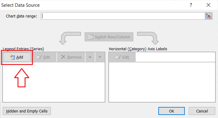
- In the next window, we must click the Add button.

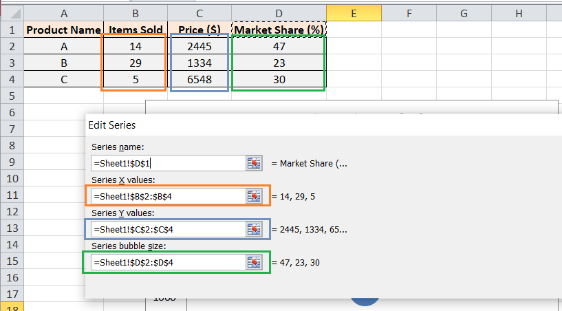
- In the Edit Series dialogue box, we must specify the data for the Bubble Chart. We select the following settings for our example data:
Select the desired name cell in a Series Name text box.
Select the desired column data to use in the X-axis in a Series X values text box.
Select the desired column data to use in the Y-axis in a Series Y values text box.
Select the desired column data to use as bubbles in a ‘Series bubble size’ text box.

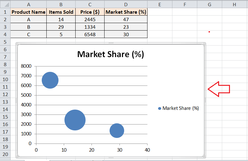
- After we have given data in the Edit Series dialogue box, we must click the OK button. After that, the Bubble Chart will be displayed on the selected sheet. As per our example data, the Bubble Chart looks like this:

That is how we can insert a Bubble Chart into an Excel sheet. However, we must customize the chart elements accordingly to make them neat and easy to understand.
Customizing the Bubble Chart
We can right-click on the chart area and specific chart elements to edit or customize them accordingly. Some essential modifications in a Bubble Chart are discussed below:
Adding a Bubble Chart Title
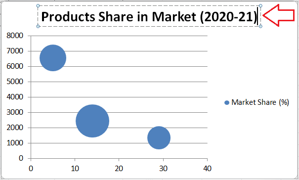
The rectangle box on the top of the inserted chart represents a Chart Title, and it can be edited by double-clicking using the mouse. We can enter any desired title for the Bubble Chart.
In our example Bubble Chart, we enter the title ‘Products Share in Market (2020-21)’, as shown below:
Adding Data Labels in Bubble Chart
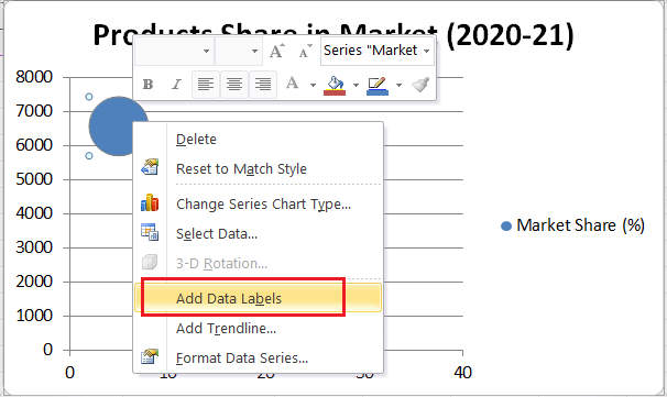
Now, we have added the Bubble Chart to our sheet. To make it easier to understand, we can add labels on plotted bubbles. For this, we need to right-click on any bubble and select the option Add Data Labels, as shown below:
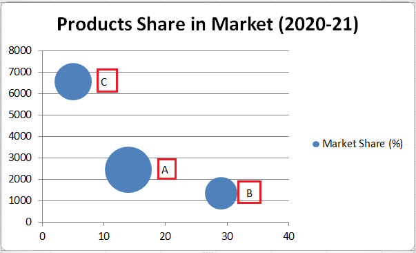
We can edit the labels as per our requirements. Our example chart looks like this after we insert data labels:
Changing Chart Layout and Styles
If we want to change chart layout and/or style, we can choose the desired layout and/or chart styles under the Design tab, as shown below:

Changing a 2D Bubble Chart to a 3D Bubble Chart
If we want to change a 2D Bubble Chart to a 3D Bubble Chart, we need to navigate to Insert > Scatter (X, Y) or Bubble Chart > 3-D Bubble. In Excel 2010, we must navigate Insert > Other Charts > Bubble Chart > 3D Bubble.
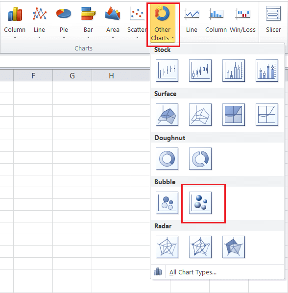
After we select the 3D Bubble Chart, the bubbles circles are replaced with the bubble spheres. Our example chart looks like this:
Advantages of Bubble Chart
The following are some advantages of using the Bubble Charts in Excel:
- A Bubble Chart can be used or plotted for three-dimensional data sets.
- A Bubble Chart representation is a lot better than the data in table format.
- The different sizes and colours of the Bubble Chart catch others’ attention and looks visually attractive.
Disadvantages of Bubble Chart
The following are some disadvantages of using the Bubble Charts in Excel:
- A Bubble Chart can be sometimes difficult for readers to understand. One must have basic chart knowledge to understand the Bubble Charts in Excel.
- The size of the bubble can be confusing in some cases. Moreover, the bubbles can overlap and get hidden if two or more data points contain the same X and Y-axis values.
- Adjusting the formatting and adding data labels in large Bubble Charts is complex when working with Excel 2010 or lower versions.
Important Things to Remember when using Bubble Chart
Some of the essential things that we must remember while plotting a Bubble Chart are listed below:
- We must try to create a Bubble Chart with at least four rows or columns of data. If we plot a Bubble Chat using three or fewer rows/ columns, the chart usually does not form a bubble properly.
- It is suggested not to select the row or column headings while creating a Bubble Chart. Because if we select the headings as the part of the data, the chart may display some incorrect results.
- When choosing colours for bubbles, we must not pick extra bright or flashy colours because they can spoil the overall appearance of the chart.
- It is recommended to format the chart elements as much as possible. For example, data labels, chart title, axis title, data points, etc. Proper formatting of chart elements makes it easier to understand or study the chart.


