Chart with a lot of data in Excel
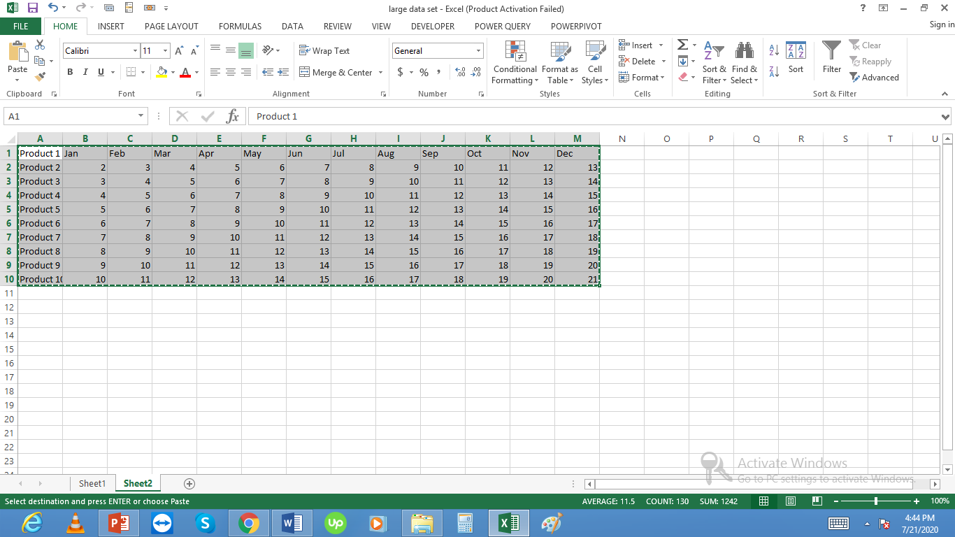
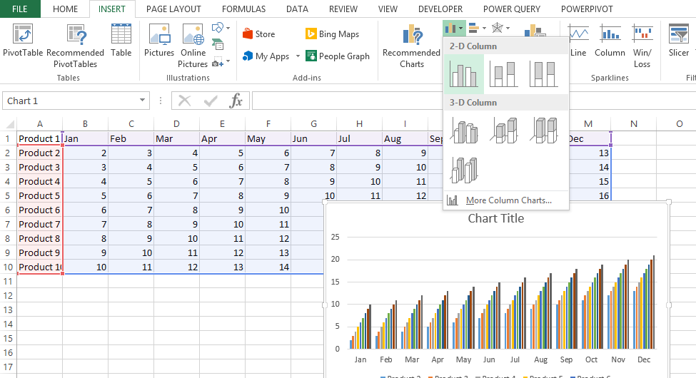
 Let’s create a chart for these 10 products. Select this data and from insert select 2d column chart:
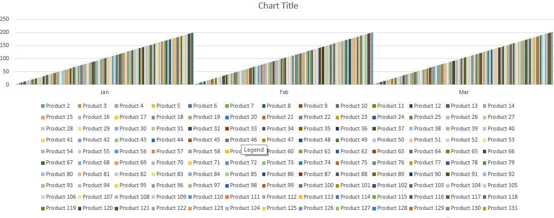
 This chart looks easy to understand. Now the problem arises if the number of products are large say 200 products. With 200 products the chart will look like this:
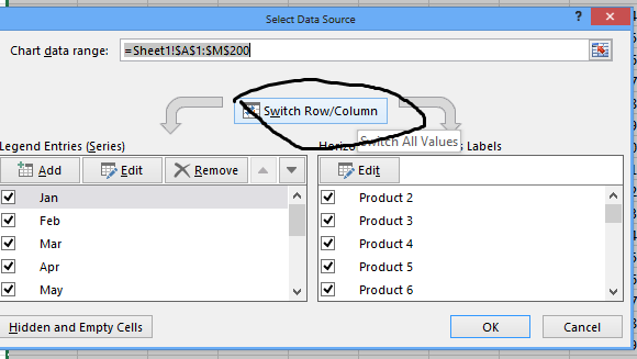
It is not understandable so we can do some tricks to make it look better. First we can switch rows and columns in cart and will check the results:

Now the chart looks more understandable.

We can also do more tricks like removing some months to say create quarterly charts.

Similarly we can create pivot table to make the data more readable and create pivot charts for the same etc.:
Template
You can download the Template here – Download
Further reading:
Basic concepts
Getting started with Excel
Cell References


