

Gantt Chart Excel
As we know, MS Excel is one of the essential spreadsheet tools and visualizing the data using charts is one of the core features of this powerful tool. Excel offers a wide range of chart types, and each chart has a specific purpose. Gantt Chart is one specific type of Excel chart that allows users to track their progress in a particular project, task or other activities.

In this article, we discuss the brief introduction of the Gantt Chart used in MS Excel. We also cover the basic steps on how to create a Gantt Chart in Excel easily. The Gantt Chart is a very useful chart type for project managers.
What is a Gantt Chart in Excel?
A Gantt chart in Excel represents the breakdown structure of any project by displaying project start dates and end dates, along with intermediate relationships between relevant activities. This chart mainly shows projects or related tasks through cascading horizontal bars, which helps us monitor the project’s overall performance for a defined timeline or planned milestone.
Gantt charts are considered an essential tool for the graphical representation of tasks or activities against pre-determined standards. It helps the users to regularly track the progress of tasks, projects or any relevant activity. Gantt chart is one of the essential tools in the field of project management. Unfortunately, the Gantt chart is not a part of the Excel inbuilt chart. Instead, it is created using a 2-D stacked bar chart that includes durations for tasks and specific formatting.
Note: The Gantt chart is named after Henry Gantt, an American mechanical engineer and management consultant who first introduced this chart type around the 1910s.
Uses of Gantt Chart in Excel
The Gantt Charts are mostly used to plan or schedule products, and project managers use this chart type to simplify the entire project in easy steps that can be completed sequentially. Moreover, the chart also helps to determine the real-time progress of the project as it progresses. We can easily find the use of Gantt Charts in almost every industry to plan, schedule and execute specific projects, including construction, marketing, manufacturing, software development, consultation, and event planning.
When should we use a Gantt Chart in Excel?
When it comes to deciding whether we should use Gantt charts or not, we should examine the following requirements:
- If the project has a specific deadline.
- If multiple people or teams are working on the same project and need to be coordinated.
- If team members work on different parts of the project, the manager or leader needs to arrange their workload to make the overall project fluid.
- If the project leader wants to analyze the visual timeline and progress of the project from start to end.
- If the project is complex and we need to simplify the workflow in a specific order.
- If we have an estimate of how much time each task of the project may take and how many people should be involved to complete a project within the given time.
If any of the above requirements are applicable in our project, we can consider using the Excel Gantt Chart.
How to create a Gantt Chart in Excel?
When it comes to creating Gantt charts in Excel, it is unfortunate that we do not have a direct option to select this particular chart from the Charts section in one click like other popular Excel charts. We should use a bar chart in excel and then arrange its formatting, styles to make it look like a Gantt chart. Each bar plotted in the plot area represents the specific tasks and the time taken to complete the specified tasks.
Although creating a Gantt chart is a bit lengthy, it is quite easy to create. The same process works for all the Excel versions, including Excel 2019, 2016, 2013, and others.
Steps to create a Gantt Chart in Excel
We need to follow the below steps to create or insert Gantt chart in our excel sheet:
Step 1: First, we need to create a project table (entering data) in an Excel sheet with the columns, such as the tasks, start dates and durations. These columns are necessary to create a Gantt Chart. Despite this, each task must be listed in a separate row in the column named tasks.
Step 2: Next, we need to select the Start Dates with header and insert a Stacked Bar Chart from Insert > Charts > Bar > Stacked Bar.
Step 3: After that, we need to right-click on the inserted chart and click the ‘Select Data’ option to add the second necessary column data, i.e., Duration Data.
Step 4: After selecting the desired data, such as the start dates and durations, our stacked bar chart with default formatting will be inserted in our sheet.
Step 5: Like the previous step, we need to supply tasks descriptions to our chart.
Step 6: Lastly, we need to convert the Stacked Bar Chart to Excel Gantt Chart. For this, we must format the Data Series of Start dates and make the corresponding data transparent or hidden. Since the supplied tasks appear in reverse order by default, we need to format axis options and put the categories in reverse order to arrange the tasks properly.
That is how we can insert/ create a Gantt Chart in Excel. Although the process is a bit lengthy, it is better to understand the process with an example.
Let us understand the step-by-step tutorial on creating a Gantt chart in Excel with the help of an example and relevant images:
Example: Creating a Gantt Chart to track Program Schedule
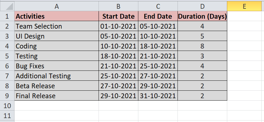
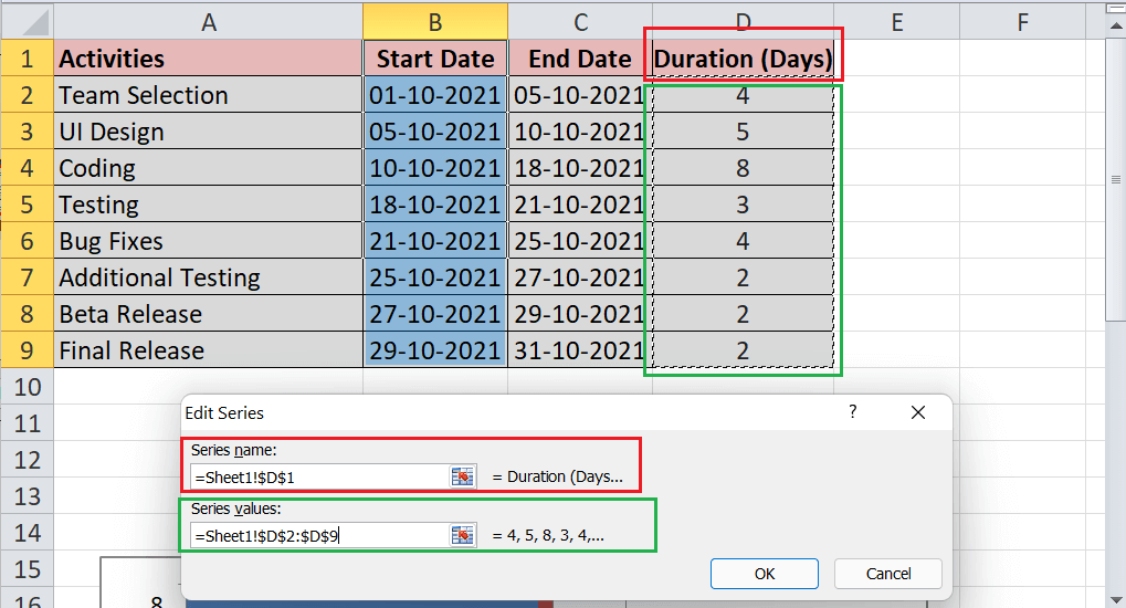
Let us consider our monthly activities for software development as an example. We need to enter day to day activities in an Excel sheet and mention start times, durations, and end times, including the activity names. The start times and corresponding durations for each activity are the important factors, while the end times are used as references. After creating a project table, our example sheet looks like this:
In the above sheet, we have applied the following formulae:
- =DATE(year,month,date): To enter start dates and end dates.
- = (C2-B2): To calculate durations.
We need to create a Gantt Chart for our month’s activities to track our schedule easily. For this, we need to perform the following steps:
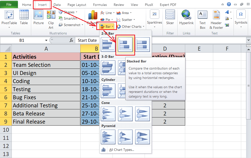
- First, we need to select the start times of activities (B1:B9). Next, we need to go to the Insert tab and click the stacked bar chart under the Bar Chart section.

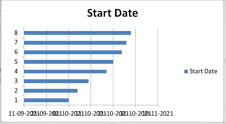
- Once we click the stacked chart, our stacked bar chart will be inserted into our sheet. Our example data looks like this:
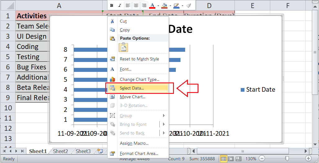
- We need to insert the duration series data into the chart. For this, we need to right-click on the inserted chart and click the ‘Select Data’ option, as shown below:
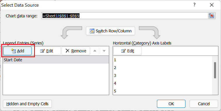
- On the Select Data Source window, we need to click the Add button.
- Next, we need to select the cell D1 for series name and select cells from D2 to D9 for series values. After that, we need to click the OK button to add the duration series data to our inserted chart.
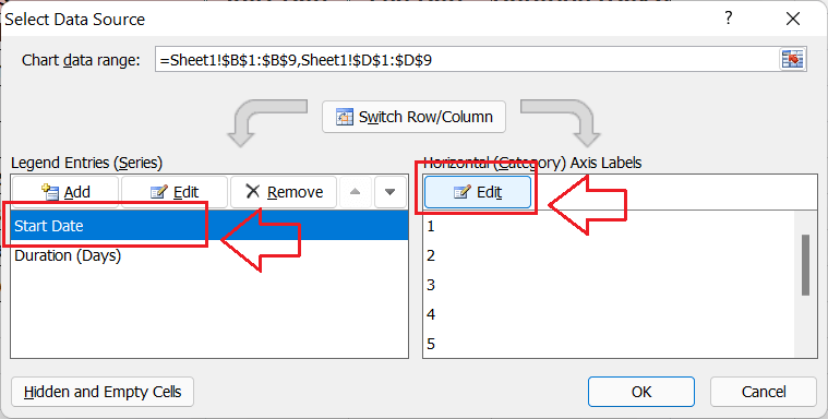
- After adding durations in the list under the Data Source window, we must select Series 1 (or Start Date) and click the Edit button.
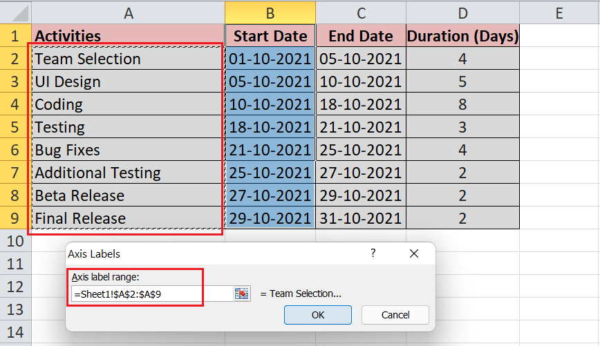
In the Edit window, we must insert vertical axis values; it usually requires the activities we have entered in the sheet.
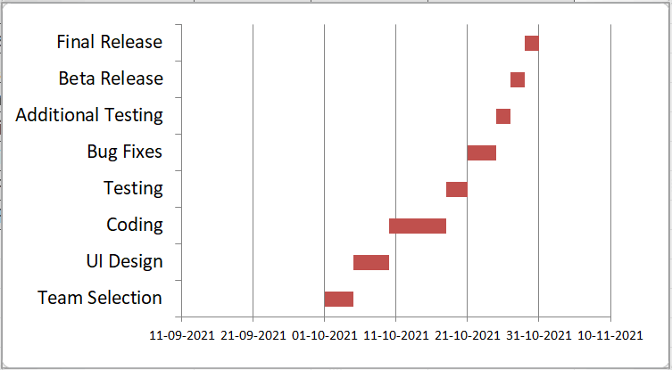
- After adding the vertical axis values, we need to click the OK button, and our chart will add data for other series and the activities. Our example chart looks like this:
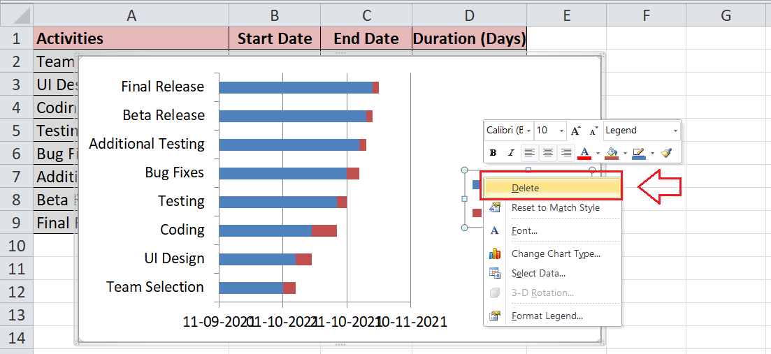
Since the inserted chart is a stacked bar chart, we need to adjust some formatting and preferences to transform it into a Gantt Chart. - Next, we need to remove the legend. For this, we need to right-click on the legend and click the option ‘Delete’.
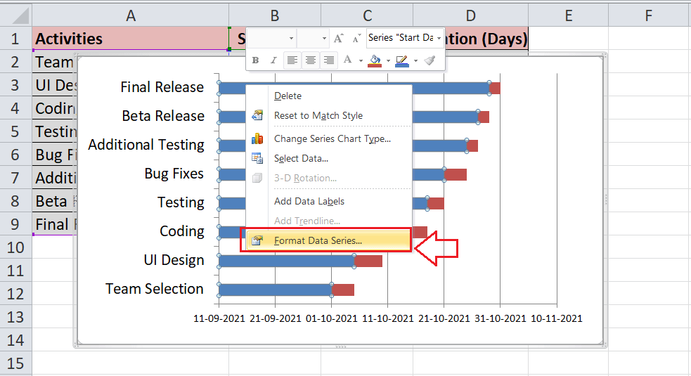
- Finally, we need to transform the inserted stacked bar chart into a Gantt Chart. Therefore, we must select any of the start dates bars (blue bar in our example), press right-click, and select the option “Format Data Series”.
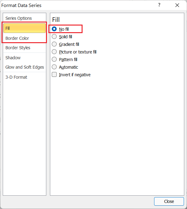
- We need to select ‘No fill’ for the ‘Fill’ option and ‘No line’ for the ‘Border Colour’ in the next window.
This will make start date bars invisible, as shown below:
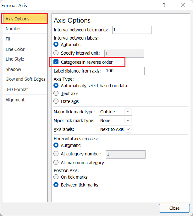
- Since our activities in the inserted chart are listed in reverse order (from the bottom activity to the top activity as per our table), we need to fix it. For this, we need to double-click on the list of activities in the chart area and select the checkbox for an option ‘Categories in reverse order’ from Axis Options.
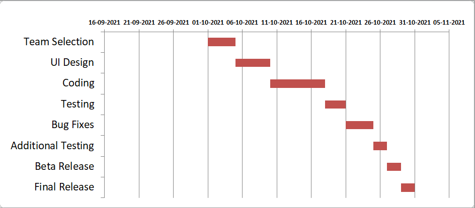
By doing this, our activities are arranged properly, and corresponding date markers are moved to the top side of the chart, as shown below:
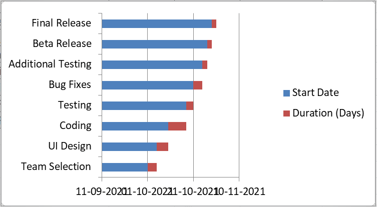
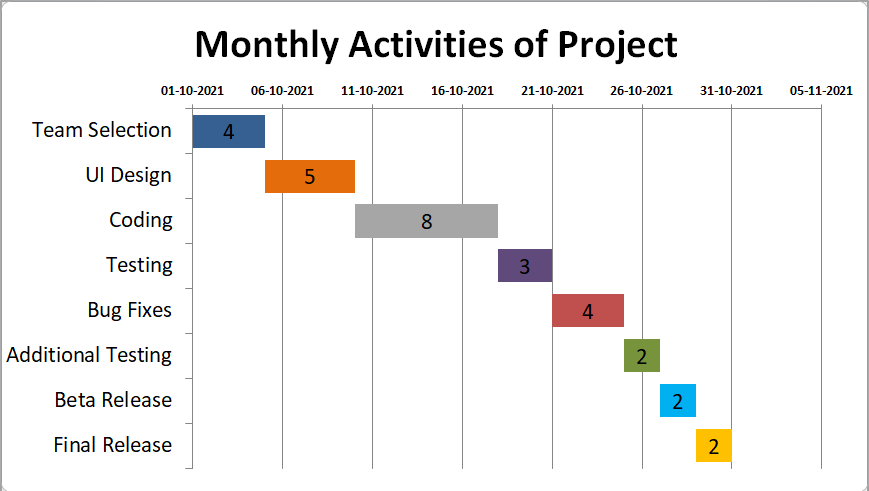
- Although the desired Gantt Chart has been inserted, it is good to improve its design by removing empty spaces on the left side, changing colours, adding a title, data labels, etc. After making some changes, our example Gantt Chart looks like this:
Saving Excel Gantt Chart as Template
Since creating a Gantt chart in Excel is a bit lengthy, it is good to save the created Gantt chart as an Excel template. So, whenever we need to use the Gantt chart again in future, we can easily work on the saved template and modify the data accordingly.
To save the inserted Excel Gantt chart as an Excel template, we need to complete the steps listed below:
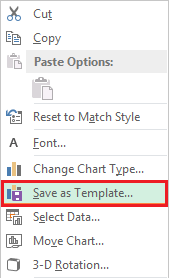
- While saving chart as a template in Excel 2013 and higher versions, we need to press right-click on the inserted chart and click the ‘Save as Template’ option.
In Excel 2010 and lower versions, we need to go to the Design tab that we can access after selecting the inserted chart. Later, we must click the tile/ shortcut associated with the ‘Save As Template’ option, as shown below:
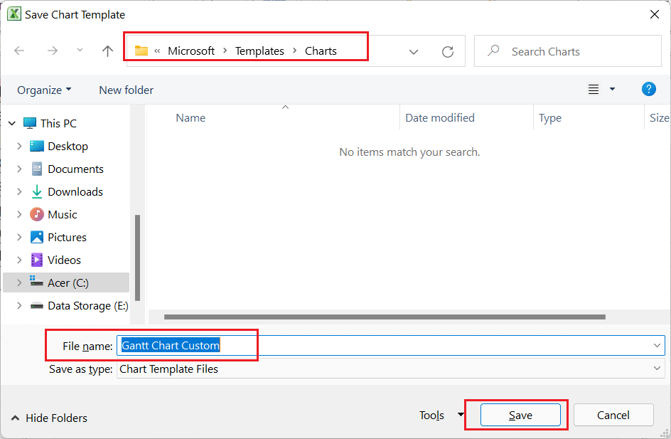
- After clicking the ‘Save as Template’, we will see a ‘Save Chart Template’ dialogue box. We can enter the desired name for a template and choose a location to save it.
By default, Excel saves the chart templates in a specific folder on a computer so that the templates are automatically added to the Templates section. If we save a template in a default location suggested by Excel, we will be able to select the template quickly from the Insert Chart or Changer Chart Type dialogue boxes.

In addition to saving the created Gantt charts as templates, we can also download the Gantt chart template. Excel has several built-in chart templates that are ready-to-use templates. We can download the specific Gantt Template from ‘Microsoft Template Store for Excel’. For this, we need to go to File > New and enter ‘Gantt’ in the search box to filter templates by chart type. We can download any desired template from the store.
Advantages of using Excel Gantt Chart
Some of the major advantages of using Excel Gantt charts are listed below:
- Gantt charts help represent complex data sets in a single diagram graphically in an easy way. It easily communicates effective or analytical insights of the works with the readers without any difficulty.
- With a little knowledge of Excel charts, one can determine specified tasks’ current status or progress in a Gantt chart.
- Proper planning is the primary step of any task, project or activity, and it is a good practice to make the plan as realistic as possible. The Gantt chart in Excel works as a special tool that helps project managers to visualize the entire movements realistically.
Disadvantages of using Excel Gantt Chart
Some of the major disadvantages of using Excel Gantt charts are listed below:
- Making a Gantt chart with many tasks or activities sometimes becomes very difficult to understand, and it looks messy.
- The sizes of the bar in Gantt Charts do not properly indicate the overall weight of the particular tasks.
- Gantt charts require regular forecasting or updating, which is usually a time-consuming task.
Important Things to Remember
- We should determine the tasks to be completed in the projects and specify the time required for each task. This will simplify the overall process in Gantt charts.
- We must avoid using complex data structures while creating or working with Gantt Charts.
- We should avoid using too many values for the X and Y-axis. Using several x or y-axis values, the inserted chart will become so long that it won’t look nice and reader-friendly.


