

How to Insert Chart in Excel
MS Excel is one of the most powerful spreadsheet tools in Office Suite, and charts are essential presentation elements of Excel. The charts help us to visualize the Excel data graphically. The graphical representation makes it easier to analyze or interpret data than the displayed data in cells. Sometimes, a simple chart in Excel can be more meaningful and helpful than a sheet full of values or numbers. Therefore, it is essential to know the process of inserting a chart in Excel.

This article discusses the step-by-step procedure to insert a chart in an Excel workbook. Since Excel has various charts, the article also covers choosing different types of charts available in Excel that best fit the Excel data.
Inserting a Chart in Excel
Inserting charts into Excel is an easy-to-use process. For instance, we take the following sheet as an example and insert a chart for it.
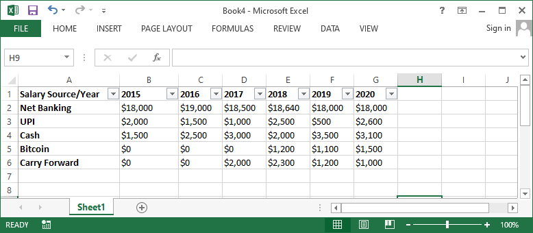
To create a chart for the above data in Excel, we need to follow the steps mentioned below:
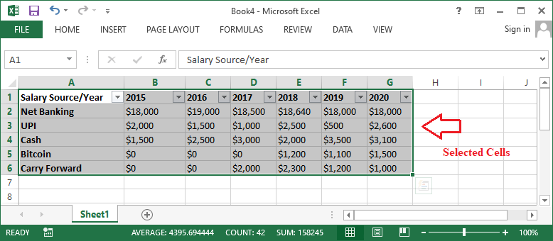
- First, we must select all the cells we want to record in a chart, including the corresponding row labels and column titles. The selected cells are used as source data for the chart to be created. In our example, we need to select cells from cell A1 to cell G6.

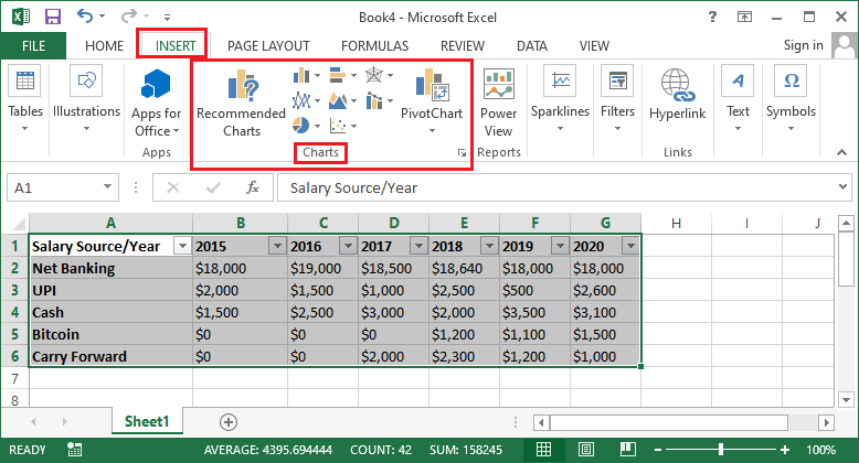
- Next, we need to navigate to the Insert tab and select the desired chart to insert from the Charts group.
If there are more charts under the selected chart type, Excel displays all the available options. For example, when we select Insert Column or Bar Chart, we get the following chart options:
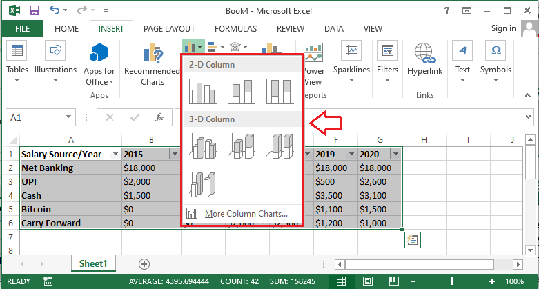
In the above image, we only need to click on the desired chart type. As soon as we click on the desired chart type, the corresponding chart is immediately inserted into the active datasheet.
Understanding Charts
A wide range of charts is supported in Excel to help us choose the right chart, making graphical representation more effective with the data. The following charts are frequently used in Excel:
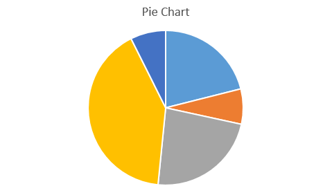
- Pie Chart: Pie charts easy comparisons between different proportions. Each value is drawn as a slice of the pie; thus, it is called a pie chart. Pie charts are mainly used when we want to quantity values and display them in percentages. These charts make it easy to see the specific values, making up the percentage of a whole pie.
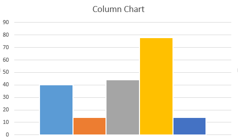
- Column Chart: Column charts represent values using the vertical bars. These charts can easily work with several data types. However, they are usually used to compare data. Column charts can be helpful while comparing values across different categories in a vertical representation.
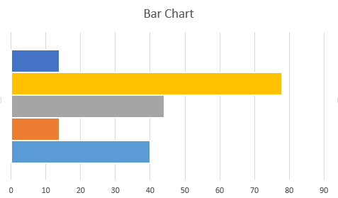
- Bar Chart: Bar charts are almost identical to column charts. The only difference between a bar chart and a column chart is that the bar chart uses horizontal bars rather than the vertical bars of the column chart. Bar charts are mostly used when we want to compare values across some categories in a horizontal representation.
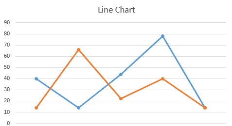
- Line Chart: Line charts are best known for highlighting trends. These charts connect data points using different lines in the graphical interface. Line charts help us understand whether the respective values increase or decrease over time, i.e., days, months, years, etc.
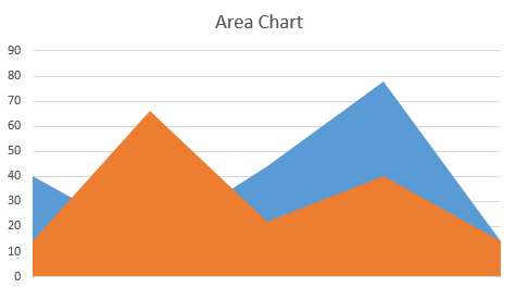
- Area Chart: Area charts work in the same way as line charts. The only difference between area charts and line charts is that the areas below the lines are filled in area charts, whereas they are kept blank in the line charts.
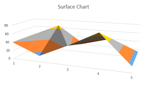
- Surface Chart: Surface charts represent data in a 3D view. They are best suited for large data. Surface charts can help us view a variety of relevant information simultaneously in a 3D landscape.
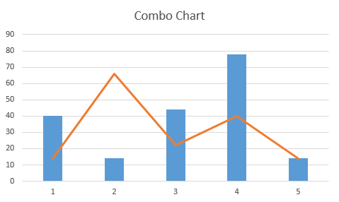
- Combo Chart: Combo charts help us select different chart types clustered together. For example, we can insert a combo chart to get a clustered column-line chart, clustered column-line in secondary axis, stacked area-clustered column, etc. Alternately, we can also customize the chart types in our style under the combo chart.
Depending on the Excel version we are using, several other charts can be found under the Charts section. Each chart is designed for a specific purpose and has its advantages. If we are not sure to select an appropriate chart type, we can go through the Recommended Chart section under that Insert tab. This option typically suggests some specific charts based on the source data.
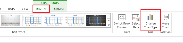
Changing Chart Type
If we insert any chart but do not like it for some reason, we can always change it to another chart type. We don’t need to repeat the whole process. We need to follow the below steps:
- In the above example, we have inserted a column chart. Now, we will replace our column chart with a line chart.
- First, we need to go to the Design tab and click on the ‘Change Chart Type’ option. We must ensure that the existing chart is selected; otherwise, the Design tab will not be displayed.
- After completing the previous step, Excel will display a dialogue box of Change Chart Type. We must click on the ‘All Charts’ tab and select the desired chart and corresponding layout. In our case, we click and select the Line chart.
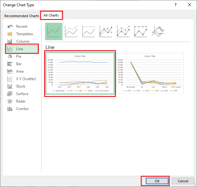
- Once the desired chart is selected, we will see a preview of the new chart. Finally, we need to click on the OK button, and the corresponding chart will be instantly inserted into our Excel sheet with the same data. In our example, the Column chart has been replaced with the Line chart.
Adjusting Chart Layout & Style
Once a chart is inserted, there are several elements of the chart that we may wish to change their parameters on how our data is displayed. It’s easy to edit the layout and style of a chart from the Design tab. Some of the most common adjustments in chart layout and style are discussed below:
Customizing Charts
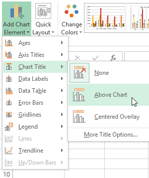
Excel allows us to add or insert desired chart elements, such as chart titles, legends, data labels, etc. Chart elements help make our charts easier to read. To insert a chart element, we need to click on the ‘Add Chart Element’ option under the Design tab, then select the desired element from the drop-down menu.
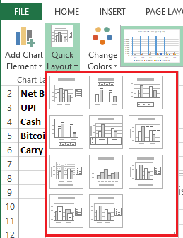
If we do not want to insert chart elements manually, we can use one of the predefined layouts of Excel. We need to click on the ‘Quick Layout’ option and select the required layout by clicking the drop-down menu icon.
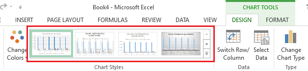
Excel also provides many different chart styles, so we can easily change the look and interface of our inserted charts. To modify the chart style, we need to choose the desired style from the Chart Styles menu.
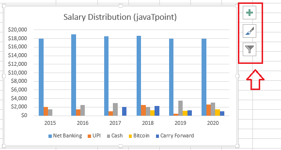
We can also use chart formatting shortcut buttons to insert desired chart elements, change chart styles, and quickly filter chart data. The shortcut is located on the right side of the chart and looks like the following image:
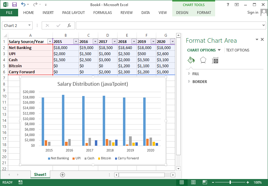
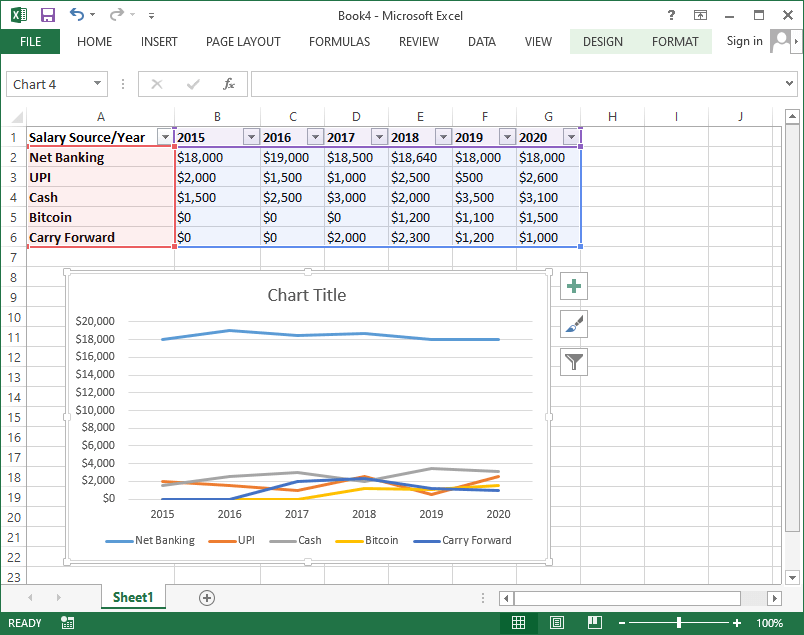
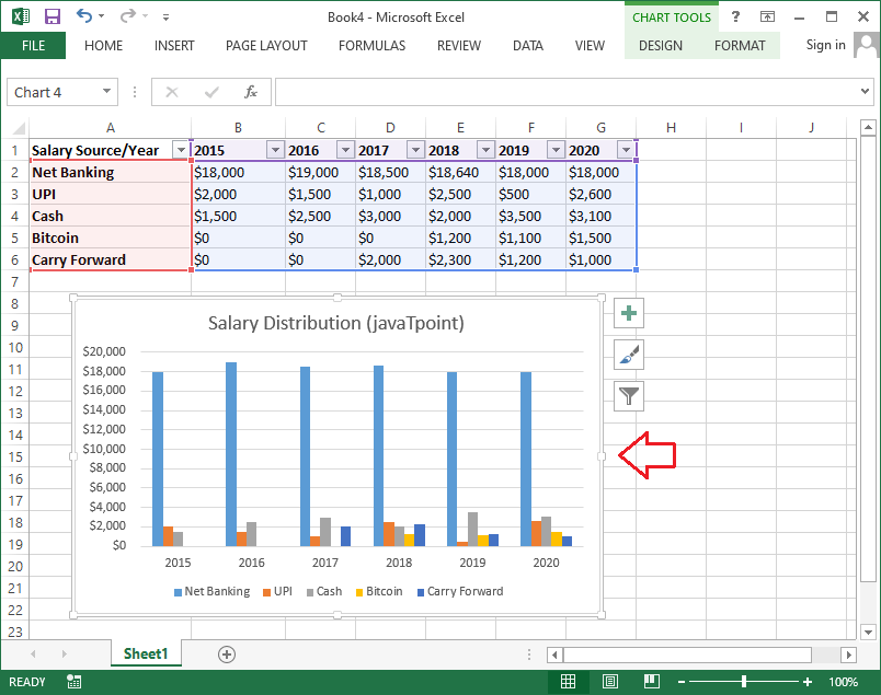
Switching Row and Column Data
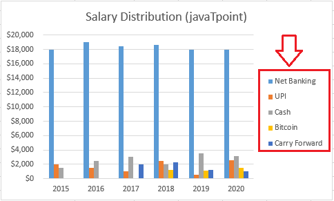
Sometimes we may need to alter the way charts group our data. For example, salary distribution data is grouped by year in the chart below, with columns for each distribution source type.
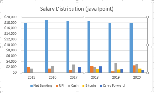
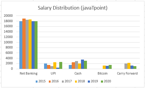
However, we can switch the rows and columns to group the data by the distribution source type, with columns for each year. In both the cases (before and after switching rows and columns), the chart contains the same data-it’s only arranged differently. We can follow the below steps to switch row and column data:
- First, we need to select a chart in which we want to switch row and column data.
- Next, we need to go to the Design tab and select the option Switch Row/ Column.
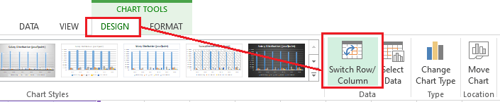
- As soon as we click the Switch Row/ Column option, the rows and columns data is switched instantly. In our example data set, the data is switched and now visible by the distribution source type, with a column for each year:
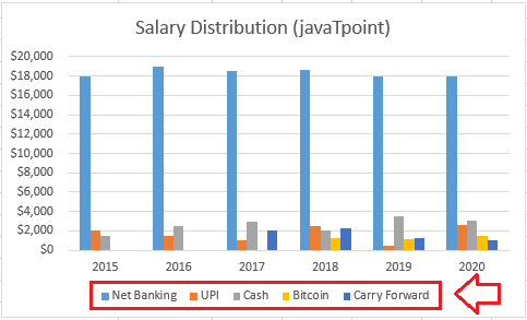
Positioning Legend
Excel also allows us to move the legend position to any side of the chart. For example, we can move a legend to the left, right, top and bottom.
We need to perform the following steps to change the legend position in our chart:
- First, we need to select the chart in which we want to change the legend position.
- Next, we need to click on the plus (+) button on the right side of the chart. After this, we will see a list of chart elements. We must select the arrow next to the option Legend and then choose the desired position for the legend in the corresponding chart.
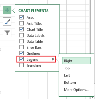
In our example data, we move the legend from the bottom to the right side of the chart:
Similarly, we can move other chart elements. Despite this, we can enable/disable chart elements by selecting the checkbox in a list that we get by clicking on the plus (+) icon from the right side of the chart.
Moving a Chart
When we insert a chart in our Excel sheet, it is inserted in the form of an object with the source data. Excel allows us to move the inserted data to another sheet. This way, we can insert an existing chart from one sheet to another and keep our data organized.
We need to follow the below steps to move/ insert a chart from one Excel sheet to another:
- First, we need to select a specific chart that we want to move into another sheet.
- Next, we need to go to the Design tab and select the option ‘Move Chart’.
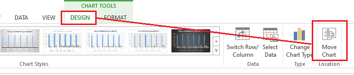
- Upon selecting the Move Chart option, Excel will display a Move Chart dialogue box.
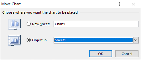
Here, we must choose the desired location or sheet to move the corresponding chart. As shown below, we choose a New Sheet option to move a selected chart to a new sheet.
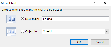
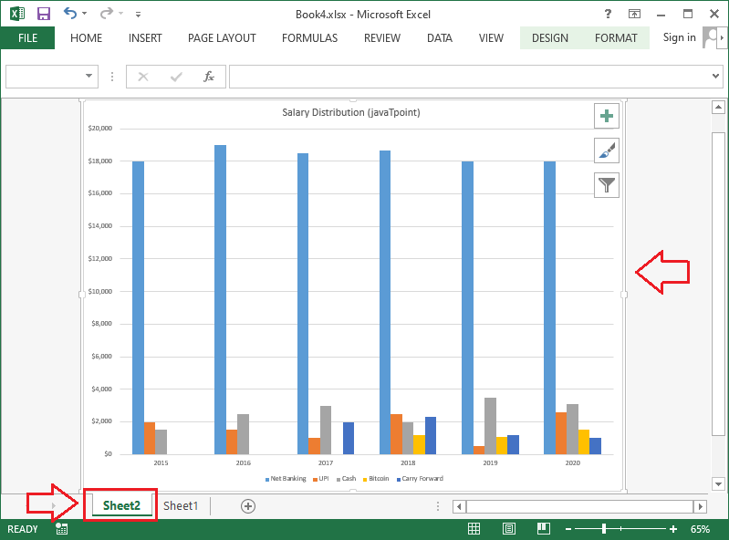
After selecting the desired location, we must click the OK button. Excel will create a new sheet, and the selected chart will be moved to the respective sheet. In our example, the chart is now moved to a new sheet, i.e., Sheet2:
Keeping Charts Up to Date
By default, when we add more data to our spreadsheet, the new data may not be included in the chart. We can fix it by adjusting the specific data range manually. We can click and select the chart, which will highlight the data range in an active sheet. We can then click and drag the handle from the lower-right corner to change the range of the data.

If we frequently add more data to our worksheets, it can become difficult to update the data range. However, there is an easier way. We should format our source data as a table, then create a chart based on that table. Adding more data to the bottom of the table will automatically join both the table and the chart, keeping everything consistent and up to date.


