How To Create A Quarterly Chart In Excel?
In order to do the same the first step will be to create quarterly sales data chart for a company have centers in 4 continents.
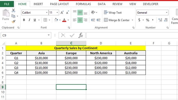
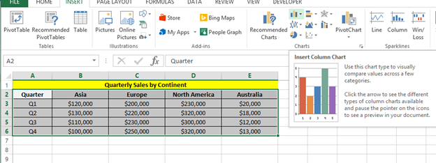
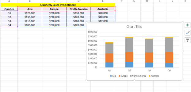
We have to arrange the data similarly to make it look easy to understand and to create the graph easily from the same. Next step is to create a simple graph from the same. Select the insert column chart option as shown below:
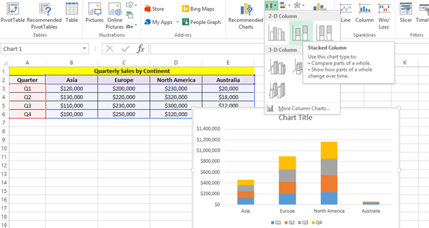
Then select the stacked column option as shown below:
Next we can change the look of the chart by switching the row and column to group by quarter to make it look better:
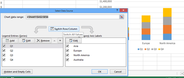
Clicking ok will make the graph look like as follows:
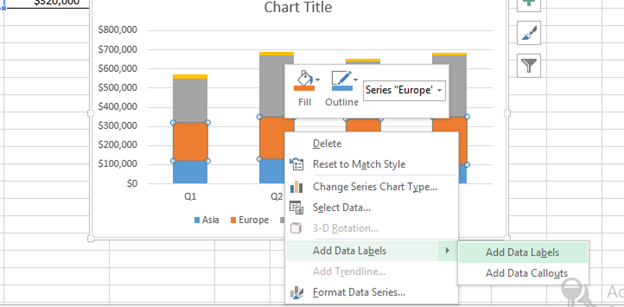
We can make more customizations like adding data labels as shown below:
We can change the chart title to the quarterly sales by continent etc as shown below:
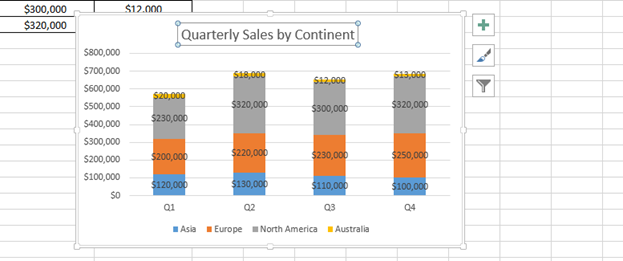
Rest we can make other customizations like we do for other graphs like moving legends up etc as per the requirements.
Template
Further reading:
Basic concepts
Getting started with Excel
Cell References


