Radar Chart in Excel
Your data can look like this:. This is simple sales table data of phones, online, email, office and shop.

How to insert Spider Chart?
You must mark all the data, in this case I am marking cells from A3 to E8.

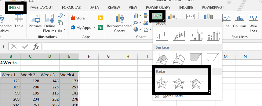
Click on insert (1), and then on radar symbol (2), and one of the radar charts (3).

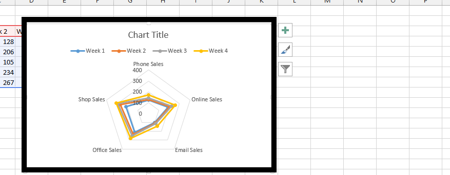
Our Radar Chart:

How to read Spider Chart?
As you may noticed Radar Chart does not like the regular Excel chart. You need to know how to read spider chart.
- each corner of the spider chart represents different category of sells
- webs (lines) represent weekly values
- the further from the center of the chart the higher sales
Advantages of Radar Chart
There are a few exceptional advantages of radar charts which you may consider during the data type choose for your data:
- radar chart is excellent to compare two different webs of values (eg. features of two different products)
- can show many information for 2-4 different categories and still remain informative
- this is very well chart to make the decision between two-four different set of values
I used to play manager computer games and remember to use radar chart to decide which football player to buy.

In this situation green web looks much better. His Defending, Speed, Vision, Attacking skills are better than in blue web. Skills of blue footballer you may consider only if you need Aerial skills of from other causes not visible in the chart (price age etc.).
The same you will see when you will compare products to advertise, companies to merge or employee to promote using Spider Chart.
Template
Further reading:
Basic concepts
Getting started with Excel
Cell References


