

Sparkline chart
While working with Excel, you often look for a method to visualize your data in a limited space. And the quick solution for this is to use the Excel Sparkline charts. Sparkline is a micro-chart in Excel that is uniquely designed to display data series inside a single cell.
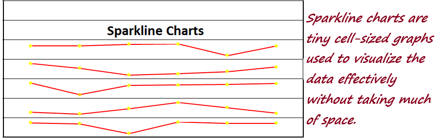
What are Sparkline Charts?
Sparkline charts are tiny cell-sized graphs. The need for a Sparkline chart was to visualize data trends effectively in a limited area without taking much space. The other name of Sparkline charts is in-line charts.
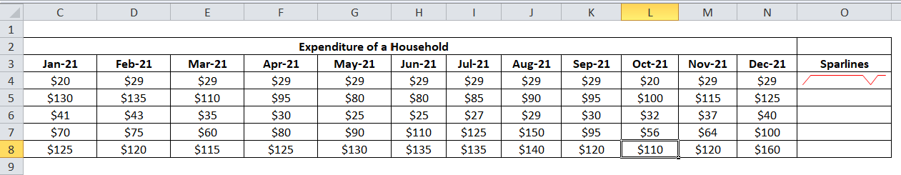
Another advantage of using Excel Sparkline charts is that they can be used in your worksheet multiple times in a tabular format with any numerical data. They are commonly used for visualizing variations in temperature, stock market, recurrent sales numbers, and all other variations over time. Sparkline charts are usually inserted next to the rows or columns of data to fetch a precise graphical figure of a trend in an individual row or column.
In Excel, Sparkline charts were initially introduced with Excel 2010 and since then are available for all later versions, including Excel 2013, Excel 2016, Excel 2019, Office 365.
How to create Sparklines charts?
To create Sparkline charts in Excel, follow the below steps:
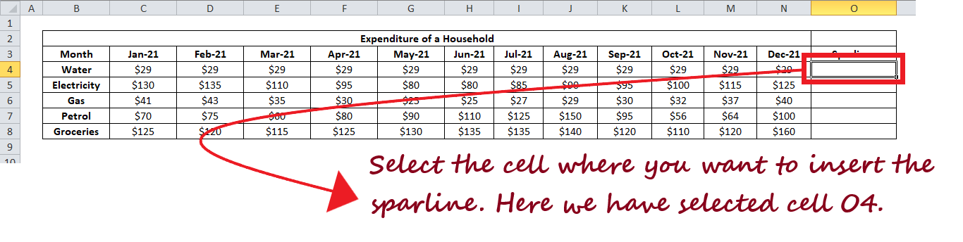
- The first step is to put your mouse cursor on the cell to show the graph.

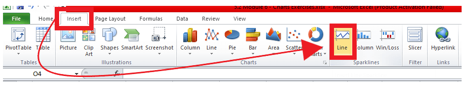
- Go to the Insert toolbar, and then in Sparklines’ section, choose any of the 3 charts you want to implement in your Excel worksheet. Unlike here, we have chosen the Line Sparkline
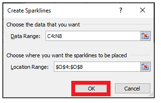
- The following dialogue will be displayed. In the data range window, select the data that you need to plot.
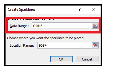
- Excel will automatically detect the cursor’s location (though you can change it) and put it in the ‘Location Range box’. Click on OK.
- As you can see in the below image, the Sparkline chart will be created in the selected cell.
How to add Sparkline charts to multiple cells?
We have already seen how to insert a Sparkline chart in a single cell. But what if we want them to appear in multiple cells? Don’t worry; it’s as simple as adding it to the first cell and copying down. However, there is an alternate method to create Sparkline charts for multiple cells in one go.
Below given are the steps to insert Sparkline charts in multiple cells:
- Go to the Insert toolbar, and then in Sparklines’ section, choose any of the 3 charts you want to implement in your Excel worksheet. Unlike here, we have chosen the Line Sparkline

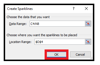
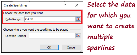
- The following dialogue will be displayed. In the data range window, select the data that you need to plot. Since we want to create multiple charts, we have selected all the data cells (don’t include the headers and text column)
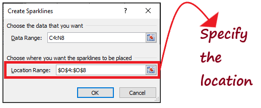
- In the Location Range box, select the correct location where you want to insert the Sparkline
- Click OK.
- To your surprise, Excel will create Sparklines for multiple cells.
Types of Sparkline Charts
They are 3 types of Sparkline Charts available in excel –
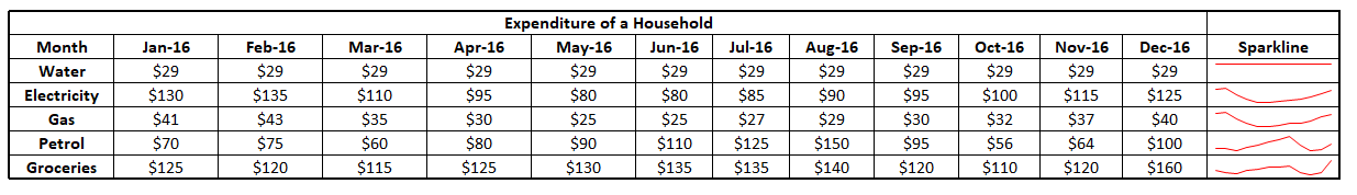
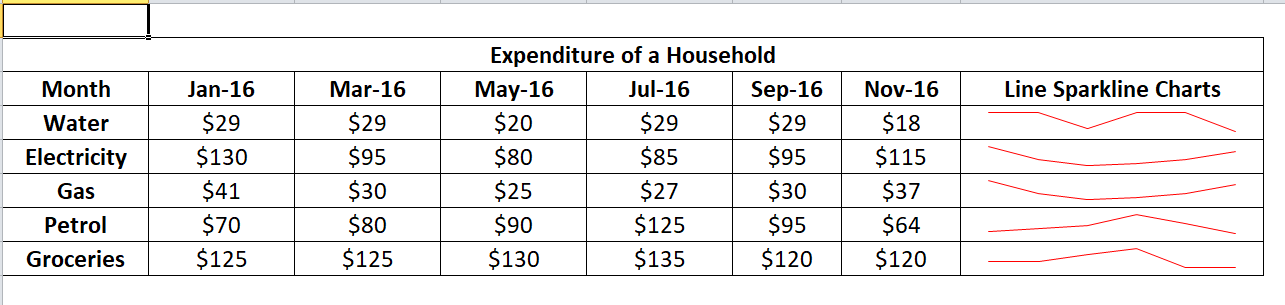
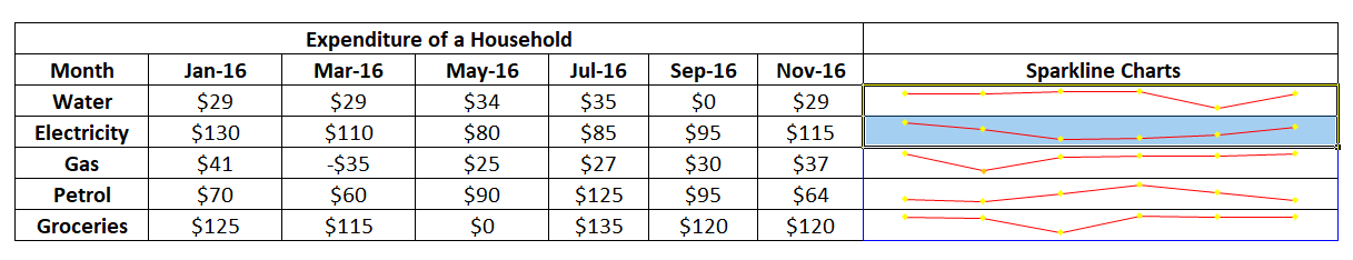
- Line: These Sparklines are similar to line charts, and they can be drawn with or without markers. Excel gives you the freedom to format the Sparkline line chart and allows you to change the colour of the line and markers. In the below example, we have plotted a Line Sparkline chart using the details of the trend for Water and Electricity.
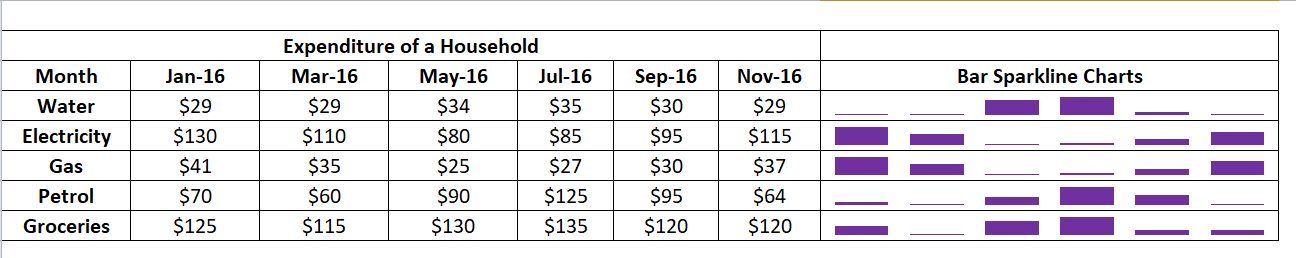
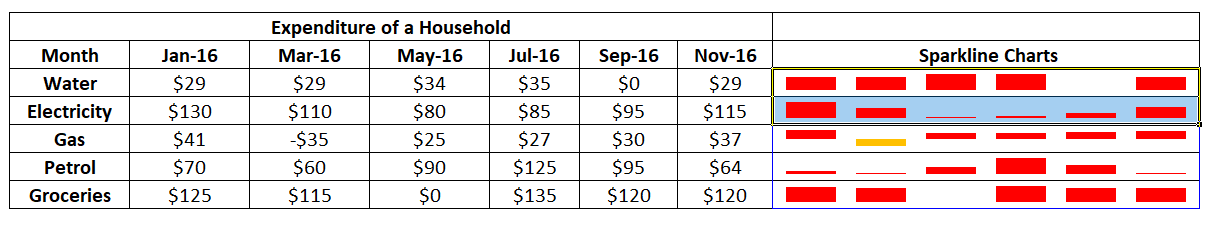
- Column: These Sparklines are similar to a column chart. Column Sparklines are cell-sized charts that look like vertical bars. It follows the same standards as the classic column chart, i.e., the positive number is shown above the x-axis, the negative is shown below the x-axis, and for zero values and charts remains flat, and no vertical bars are generated. You can format the vertical bars according to your needs and set any colour for them. You can visually distinguish the positive and negative column bars and even highlight the largest and smallest values.
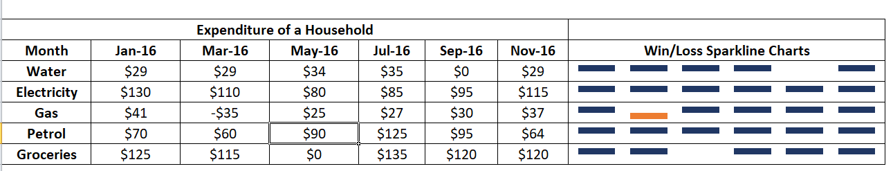
- Win/Loss: These Sparkline types display each data point in an equally heightened column bar. If the data point is positive, the bar is drawn above the x-axis, but if the data point is negative, the bar is drawn below the x-axis. For zero data points, it shows no bar.
Though the win/loss resembles a column Sparkline as they too have vertical bars, the only difference is that it does not show the magnitude of the bars and all bars are of the same height despite the original value. You can also relate a win/loss Sparkline as a binary micro-chart, commonly used to represent values having only two cases, i.e., True/False or 1/-1. For instance, it perfectly displays the game results where the value ‘1’ denotes wins, and ‘-1’ denotes loss.
As you can see in the below example, we have created a Win/Loss Sparkline where all the graphs are the same for positive cases. For negative values, the graphs are drawn below the x-axis, and for zeros, no graph is drawn.
How to change Sparklines in Excel
Excel allows you to change the type of an existing Sparkline in your Excel spreadsheet. You need to follow the below steps:
- Select one or more Sparklines in your worksheet.
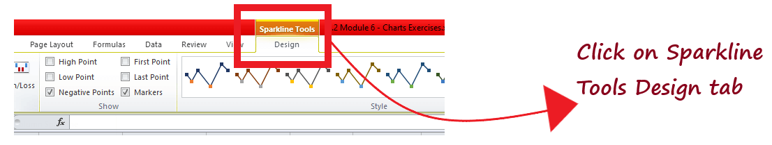
- Go to the Sparkline Designtab.
- In the Typegroup, select any of the 3 types you want to switch the existing chart.
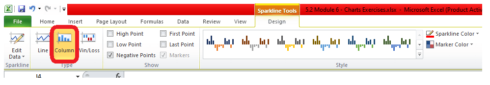
- You will notice all the line charts will get replaced with the column charts.
Formatting Sparkline
Whenever you create a Sparkline chart in your worksheet, you will notice that a ‘Design’ conceptual tab appears in the Excel ribbon toolbar. This tab holds various options using which you can then use the various options to format your chart.
1. Change Sparkline style group.
To format and change the look of your Sparklines, use the style and colour options residing on the Sparkline Tools Design tab in the Style group.
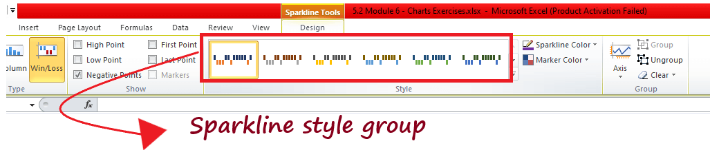
There are many predefined Sparkline styles present in the gallery, and select the appropriate one. Though in one go, you won’t be able to see them all at once. To view all the styles, click on the More button present in the bottom-right corner.
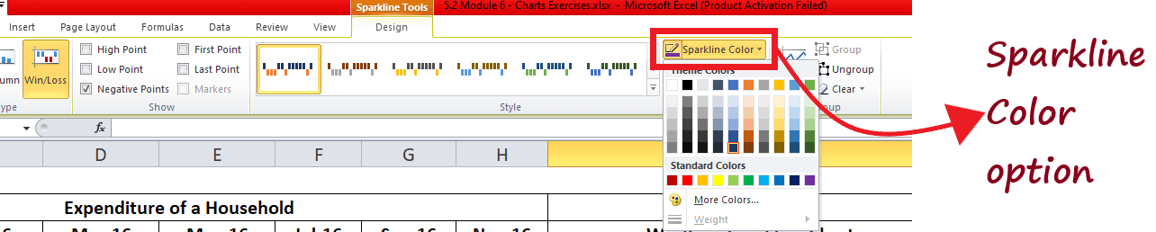
2. Change Sparkline colour
If you are not satisfied with the default Sparkline colour, click on the arrow button next to the Sparkline Color and choose any of your preferred colours.
3. Change Sparkline line width.
Click on the ‘Weight’ option and select from the predefined widths list to adjust the line width. You can also set your custom Weight. However, the Weight option is only available for the line and not the other two Sparklines (Column and Win/Loss).
4. Change Sparkline colour markers.
To change the colour markers or some particular data values, click on the arrow button next to the Marker Color, and select your preferred colour option.
How to group and ungroup Sparklines
If you have multiple Sparkline charts in your Excel worksheet, it’s always advised to group them. After Grouping, all the charts share the same formatting and scaling options, enabling you to edit the whole group at once.
To group Sparkline charts in Excel, do the following:
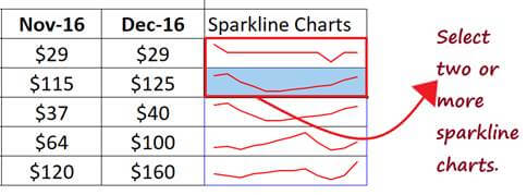
- Create the Sparkline charts and select two or more Sparklines that you want to group.
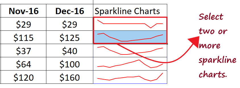
- On the Sparkline Designtab, click on the Group

To Ungroup Sparkline charts in Excel, do the following:
- Firstly, you need to group the Sparkline charts. On the Sparkline Design tab, click on the Ungroup option, and it will break a set of grouped Sparklines into individual Sparkline
Just Remember:
- Whenever you create multiple Sparkline charts in your worksheet, by default, Excel groups them automatically.
- If you select any single Sparkline in a group and apply some formatting, the same is applied for the entire group.
- All the grouped Sparklines should be of a single type. However, if you group different types, say Column bar and Win/Loss, excel will automatically convert them to the same type.
Show markers and highlight specific data points (Design Tab)
After clicking on a cell containing Sparkline chart, go to ‘Design’ tab and then to ‘Show’ group – you can use the options here to highlight different points on the Sparkline –
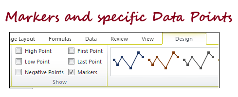
- High Point: This option is used to highlight the largest data-point
- Low Point: It highlights the smallest data-point
- Negative Points: This option highlights all the negative data points.
- First Point: It highlights the very initial data point.
- Last Point: This option highlights the last data-point
- Markers: This option highlights all data points on the line chart only (it won’t work for the column and win/loss chart)
NOTE: For all these data points, you can change the colour of the data point using ‘Marker Colour’.


