Use Sparklines To Show Data Trends In Excel
Sparklines are miniature charts that are useful in identifying trends. They are created inside the cell. They can display only one data series.
Creating Sparklines
To create a sparkline, click anywhere in the data area. Then go to the “Insert” -> “Sparklines” and choose the type.

Appears “Creating Sparklines” window.
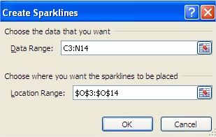
First, click inside the textbox “Data Range” and then select the cells. Below is a textbox “Location Range” It is used to identify cells in offering direct you insert your miniature graph. Use AutoComplete for the rest of the cells. You can also select multiple rows and for each of them to create one miniature graph.
Types of Sparklines
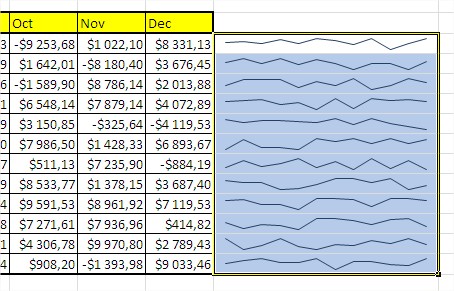
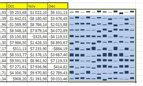
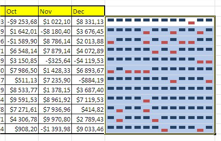
There are line chart, column chart and win / loss, which shows the positive and negative values in a series of data. To change the chart type, click on the cell that contains the graph. When you do that will see a new tab “Design”. Click on it and then on the “Type” change the chart type to one of the available options.
Line Spaklines
Column Spaklines
Win / Loss Spaklines
Highlighting Specific Points
When you insert a miniature charts, you may want to highlight certain data, such as negative and positive. When you create a miniature charts have such an opportunity. These options are available in the “Design” in the “Show”.
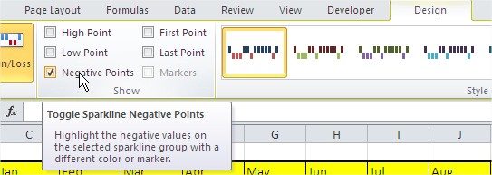
You can also change colors of chart. Go to Ribbon -> Design -> Marker Color

Removing Sparklines
You can not delete sparklines by selecting them and pressing the Delete key. You must select the cells, right-click and then select “Sparklines” -> “Remove marked sparklines.”
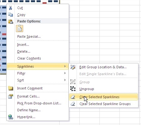
You can also do it with Ribbon. Go to Ribbon ->[click sparklines] -> Design -> Group -> Clear

Template
Further reading:
Basic concepts
Getting started with Excel
Cell References


