Treemap in Excel
Treemaps are a good option to show hierarchical data in a compact graph. Microsoft Excel enables the user to create, style, and customize a treemap in a few minutes. Treemaps are commonly used for displaying scenarios such as best-selling items, the population of a specific location, provincial sales, and similar parent-child structured data series.
This tutorial will discover about Treemap Chart, the step-by-step method to create this chart, its advantages and disadvantages, how to customize and format the Treemap chart.
What is a Treemap?
“A Treemap chart in Excel provides a hierarchical view of the dataset and designs simple spot patterns, for example, which products are the best seller for a company. In this chart type, rectangular boxes depict the tree branches, and each sub-branch is represented as a smaller rectangle.”
In other words, Treemaps are utilized to work with hierarchical data, and this data contains one-to-many relationships. Treemaps are useful for depicting items such as best-selling products, the population of any location, provincial sales, and similar data containing parent-child structuring. For example, if in the below chart you will notice look at the sales of a product based on, then the quarter is the parent with three children (the months in the quarter), and each category has either four or five children, corresponding to the products.
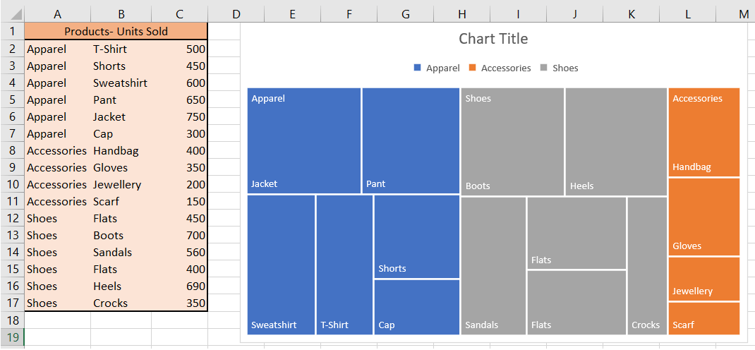
A representation of Treemap is given below:

As shown above, a Treemap chart incorporates nested, coloured rectangles that can be considered branches. Every item specified in your dataset is represented by a rectangular box wherein the value of the data determines the sizes of each box. These characteristics of Treemap make it easier to see the groups and sizes. Because the colour and size of rectangles are typically correlated with the tree structure, this chart is named Treemap.
Treemap charts are typically used when the user wants to highlight the contribution of each item to the whole dataset within the hierarchy. The advantages of using a treemap include an easy method to spot patterns, similarities, and irregularities and a structured way of displaying parts of a whole.
Basics of Treemap
A treemap chart primarily consists of 3 sections which are given below:
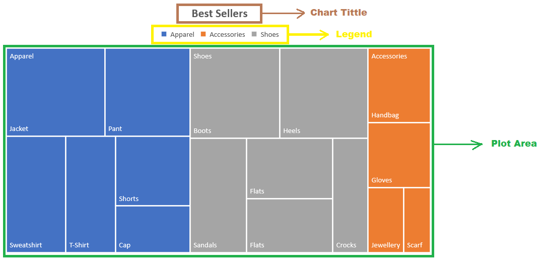
- Plot Area:This is the part where the entire visual representation of the graph befall. As you can see each rectangle of the treemap is shaded by the highest-level categories, and the sub-category (sub-branch) rectangles for each item is colored proportional to the size of numerical figures they each contribute to the dataset.
- Chart Title:This section represents the title of the chart. It helps you give your chart a descriptive name, thereby helping your viewers easily understand the visual representation.
- Legend:The legend is the part of the map that differentiates the various data series where each color is represented by one of the highest-level categories (branches).
Appropriate use cases for treemaps
Treemaps are the best choice if your dataset falls into one of the below-given scenarios:
- If you want to visualize a part-to-whole relationship amongst many categories.
- If the exact comparisons between the categories are not important.
- If the data series is hierarchical.
Limitation of Treemaps
While Treemaps may seem like a sound option for visualizing your Excel data, users often use this chart when another chart type would visually serve the dataset better.
The limitation of using the Treemap chart is that when we’re encoding the Excel data within a rectangular box where the values of the same category are distinguished with different intensities of color shades and proportions of the boxes. Our eyes aren’t great at noticing relatively minor differences in these proportions.
Sometimes we have data wherein our audience needs to make accurate comparisons between different categories. In such cases, it’s even more unmanageable when the classifications aren’t aligned to a standard baseline.
How to create a Treemap?
Creating Treemap in your Excel worksheet is very easy and simple.
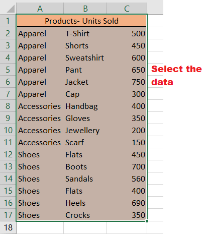
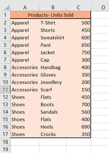
For example, in the table below, you can see we have taken a simple three-column dataset. In the first column, we have specified the category of our best-selling products. The products within each category are specified in the second column. And at last, the units sold are mentioned in the third column.
Follow the below given steps to quickly create a Treemap:
- Select the dataset.

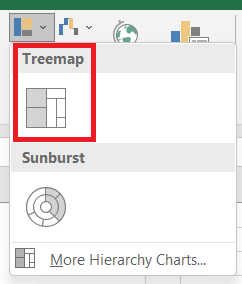
- Go to the Excel ribbon, click on the Insert tab, -> Hierarchy chart option.

- The given dropdown will be shown, select the Treemap option.

- As a result, you will notice that the Treemap chart will be immediately displayed in your worksheet. The four rectangles are grouped with their categories, wherein the size of the rectangular boxes is determined by the values provided to them.

- In the above screenshot, the Treemap has used nested, colored rectangles which you can think of as the branches. Every item in the dataset is represented by a rectangle and the sizes of each correlate to the number data.
Note: You can also use the Chart Design and Format tabs to customize your Treemap chart’s appearance and look and feel. Sometimes both these tabs are not activated. Click anywhere in the Treemap chart to activate those tabs. - Excel automatically uses a different color for each of the top level or parent categories. However, you can also use the layout of the data labels to different between the different categories of data.
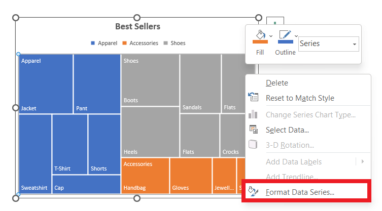
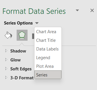
- Right-click one of the rectangles on the chart > Format Data Series.

- Under Series Options > Label Options, pick the display option you want.

- Right-click one of the rectangles on the chart > Format Data Series.
That’s it! Next, you can make some changes to the appearance, move or resize the chart, and give it a title.
How to Customize a Treemap in Excel
Charts are a visual representation of your data. It helps the users to comprehend the data quickly. Therefore, only creating a Treemap chart is not sufficient; you must customize it with appropriate pointers. Below given are some tips to accurately customize your chart:
1. Give a title to your chart
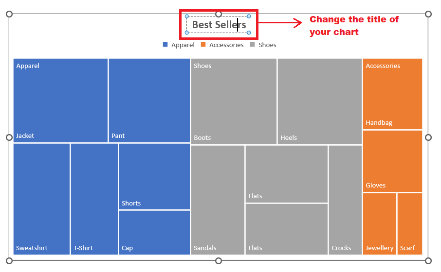
The best way to start customizing your charts is by providing an appropriate title to your treemap. Whenever you create a new chart, Microsoft aligns the name ‘Chart Title’ to it by default. All you have to do is click on the text box, it will change to dotted lines and thereafter type a new name.
2. Present Layouts and Styles
Present layouts and Styles always are a good way to compliment your charts. Select your treemap chart and go to the Chart Design tab to enable the options. You can use the combination of tools in the ribbon (change the color, change the styles, or add chart elements) to customize your chart.
Below are some examples.

3. Fill, line styles and colors, effects
Microsoft Excel provides an option, ‘Format Chart Area Sidebar’, that allows the user to fill and line styles and colors and prompts effects like shadow and 3-D.
- To enable the option, either right-click the chart and pick the “Format Chart Area” from the dialog window or double-click the Treemap to open the sidebar.

- On the right-side pane, you will notice the various data series options. Apply any of them to make your chart visually attractive.

4. Resize your chart
Microsoft Excel allows you to move and resize your chart to any specific location on your existing worksheet. To move your chart to a new spot on your worksheet, select it, and drag and drop it where you want it.
You can drag it inward or outward from a corner or edge to resize the chart. Drag the chart inward if you want to increase the size of your chart; else, drag it outwards if you want to reduce the size of the size.
Move a chart to another worksheet
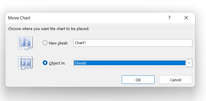
By default, Excel charts are created inside the same worksheet you have selected for the dataset. But many times, we want to move our chart to another worksheet. How to do it? To cater to this, Microsoft Excel has an inbuilt option known as the ‘Move Chart dialog’.
Enable the option by clicking on the Move Chart icon placed under the DESIGN tab. Or you can access it by right-clicking on the menu of the chart itself. Always make sure to right-click in an empty spot in the chart area to see this option.
The Move Chart dialog window further carries the following 2 options:
- New sheet: Selecting this option moves your chart to a new sheet. Select the chart and enter a name to create a new worksheet.
- Object in: Selecting this option enables the user to relocate the chart to the existing worksheet. Select the name of an existing sheet from the dropdown input to position your chart to that worksheet.
Charts are awesome visuals that can help display your data in easy-to-read ways for your audience. Go ahead and present your data in a visually attractive format using an Excel Treemap chart.


