

Type of charts in Excel
It is sometimes difficult to interpret the Excel data due to complexity and size of data. So, charts are a way to represent the data graphically and interpret the data easily. Charts are the visual representation of data.
Excel provides charts to take advantage of graphical representation. The data represented through charts is more understandable than the data stored in an Excel table. This makes the process of analyzing data fast. Excel users can fast analyze the data.
Graphical representation of data using charts makes complex data analysis easier to understand. Excel has a variety of charts, each with its own different functionality and representation style.
Charts offered by Excel
Excel offers many charts to represent the data in different manners, such as – Pie charts, Bar charts, Line charts, Stock charts, Surface charts, Radar charts, and many more. You can use them according to your data and analysis. All these charts
There is a list of basic and advanced level of charts used for different purposes to interpret the data.
These are the most used charts of Excel that an Excel user usually requires.
Microsoft Excel introduce one more new chart called Treemap chart for 2016 and newer version. It has come with some advanced features and representation styles.
We will illustrate each chart and its functionality with an example in this chapter. Learn carefully and use them accordingly.
Column Charts
A column chart is basically a vertical chart that is used to represent the data in vertical bars. It works efficiently with different types of data, but it is usually used for comparing the information.
For example, a company wants to see each month sell graphically and also wants to compare them. Column charts are best for it that help to analyze and compare each month’s data with each other.
Excel offers 2D and 3D column charts.
Line Chart
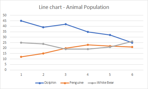
Line charts are most useful for showing trends. Using this chart, you can easily analyze the ups and downs in your data over time. In this chart, data points are connected with lines.
For example, a company wants to analyze the sell of products for the last five years graphically. Additionally, it also wants to analyze the ups and downs of each year product sell.
Excel offers 2D and 3D line charts.
Bar chart
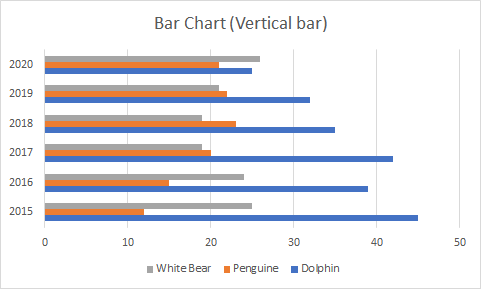
Bar charts are horizontal bars that work like column charts. Unlike column charts, Bar charts are horizontally plotted. Or you can say that bar charts and column charts are just opposite to each other.
For example, a company uses the bar chart to analyze the data through vertical bars to represent the data graphically. You can see as well as compare the values to each other, respective to data.
Area chart
Area charts are just like line charts. Unlike the line charts, gaps are filled with color in area charts. Area charts are easy to analyze the growth in business as its shows ups and downs through line.
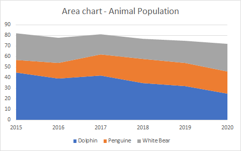
Similar to the line charts, data points in area charts are connected with lines.
Pie chart
A pie chart is a rounded shape graph that is divided into slices of pie. Using this chart, you can easily analyze data that is divided into slices. It makes the data easy to compare the proportion.
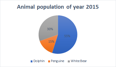
Pie charts make it easy to analyze which values make up the percentage of whole. Pie chart is also known as Doughnut chart. Excel offers 2D and 3D pie charts.
Surface chart
Surface chart is actually a 3D chart that helps to represent the data into a 3D landscape. These charts are best to use with a large dataset. This chart allows to displaying a variety of data at the same time.
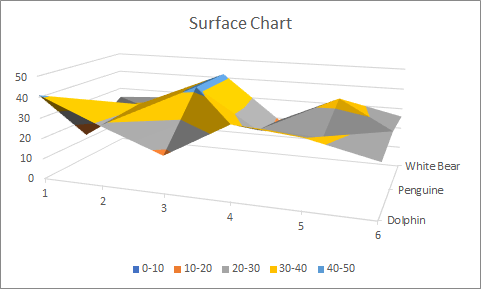
A large dataset is not easy to represent using other charts. Surface chart solve this problem that allows displaying large datasets using this 3D chart.
Choose your charts wisely
Excel offers too many charts as well as their 2D and 3D type. You can use any of them but choose them wisely according to your data. Different scenario requires different charts. Though, it can display all and correct information.
We have a list of some points for each type of chart that helps you to choose the chart wisely. Read them carefully –
| Chart Type | When to choose this chart | |
|---|---|---|
| 1. | Column Chart | Use the column chart when you want to compare the multiple values across a few categories. The values are shown through vertical bars. |
| 2. | Line Chart | Choose this chart when you want to show the treads (ups and downs) over a period of time, like for months or years. |
| 3. | Bar Chart | Like the column chart, use this chart to compare the values across a few categories. In this chart, values are displayed in the horizontal bar. |
| 4. | Area chart | Area chart has the same pattern as the line chart. This chart is best to use for indicating a change among different sets. |
| 5. | Pie or Doughnut chart | Pie chart is best to use when you want to quantify the values and show them as percentage. |
| 6. | Surface chart | Surface chart is different than other charts. Use it when you need to analyze the optimum combination between two sets of data. |
How to insert a chart?
Excel enables easy to use user interface using which you can easily insert a required chart for your data. You need to follow few simple steps, Excel > Insert tab > Chart section > choose a chart.
We will illustrate these steps from start to end for creating the chart for Excel data. Following are the steps to insert a chart in Excel.
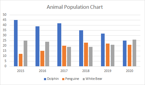
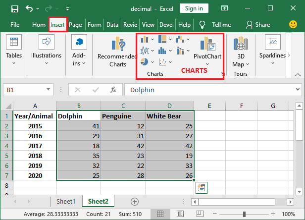
Step 1: We have the following dataset (Animal population rate for six years from 2015-2020) for which you want to create a chart in Excel.
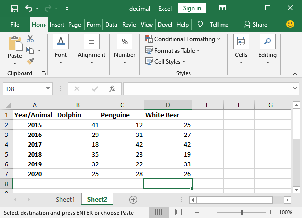
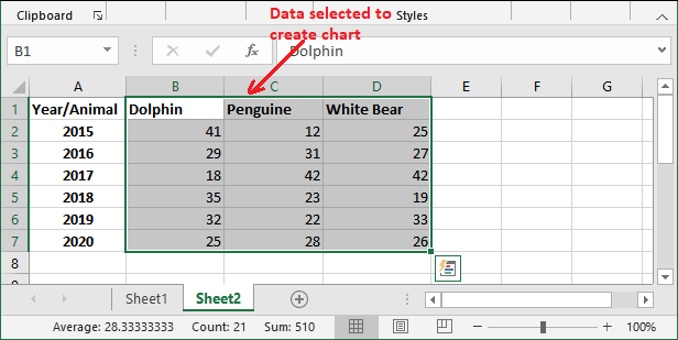
Step 2: Select the data, including column header and row label for which you want to create a chart. This data will be the source data for your chart.
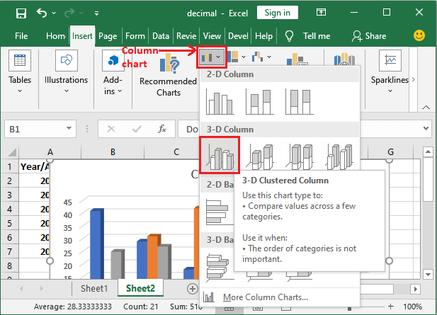
Step 3: Navigate to the Insert tab in the Excel header, where you will see a charts section that contains a list of all these charts.
Step 4: Choose a chart from here according to your data. We have chosen a 3D Column chart containing vertical bars for your data.
Step 5: The selected chart is inserted into your Excel worksheet. Initially, the chart looks like this for the data selected in step 2.
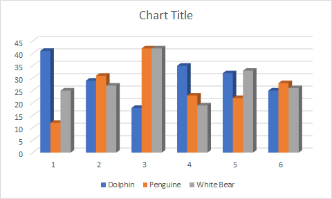
Currently, this chart does not have a valid title, clear values for analysis, and more. You can set up all these things in your chart by modifying it.
Step 6: Double-tap on the Chart Title to make it editable and then provide a new valid title that suites to it.
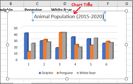
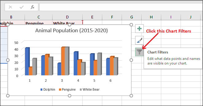
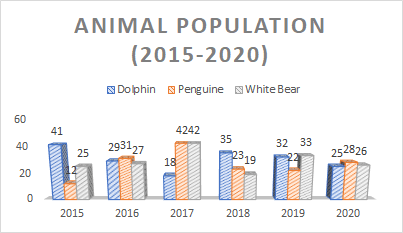
Here, Blue color vertical bar is representing to Dolphin, Orange vertical bar to Penguin, and Grey vertical bar to White Bear population count.
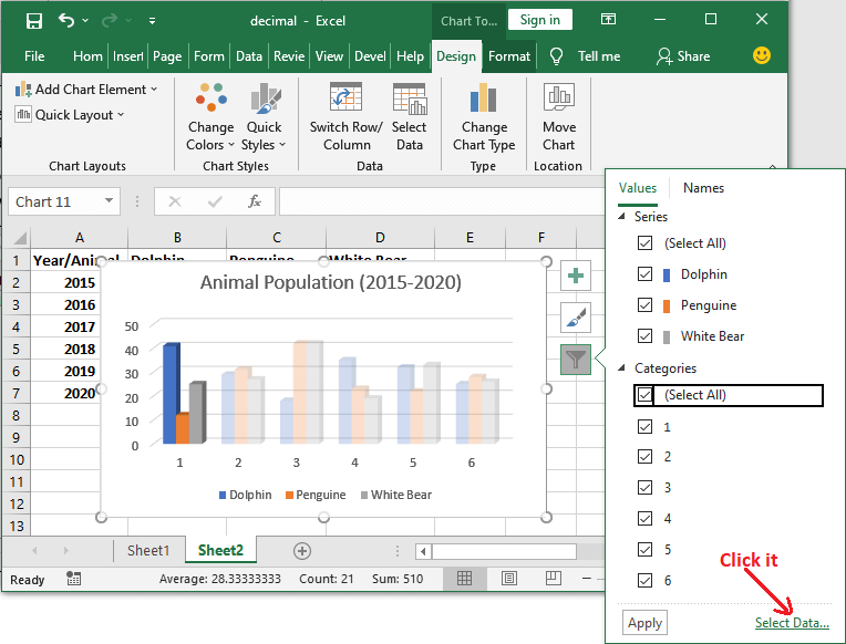
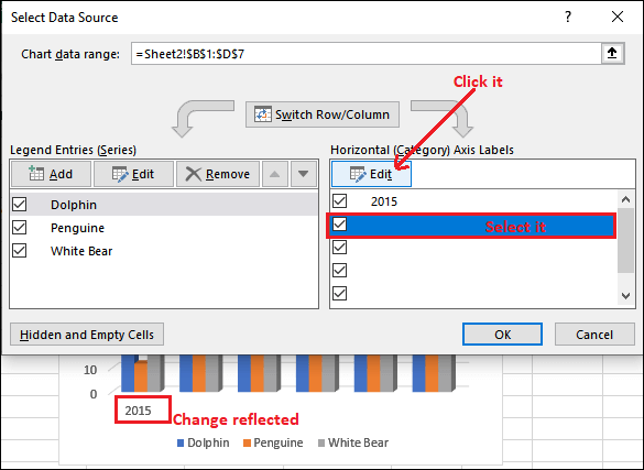
Step 7: You can also define each vertical bar for its year so that the user can easily analyze the values. Click on the Chart Filters icon here.
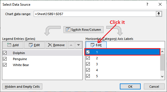
Step 8: Click on the Select data present at the bottom of the list to replace the years 2015 for each vertical bar.
Step 9: Here, select the number 1 to replace it with year 2015 and click the Edit button.
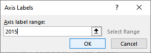
Step 10: Enter the year and click OK.
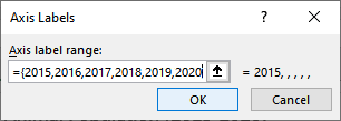
Step 11: The year 2015 will immediately reflect on the chart, and all other become blank. Now, to put all other years for each vertical bar, click one more time here.
Step 12: Add more years from 2016 to 2020 inside curly braces separated by a comma and click OK.
{2015,2016,2017,2018,2019,2020}
Step 13: All values are now added. So, click OK.
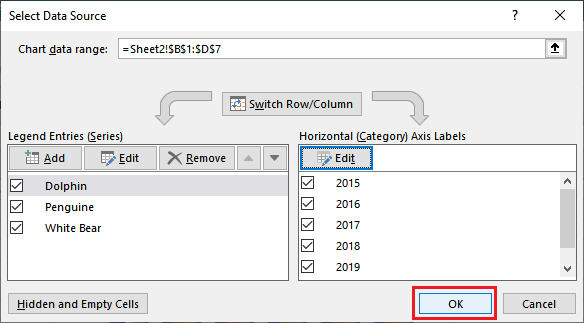
Step 14: See the charts that the years are reflected on the chart correspond to each vertical bar.
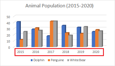
You can see that the exact value is not defined at the end of each bar. Only the graph is showing. Excel enables the users to choose a detailed bar.
Step 15: Choose another chart style for the Column chart for detailed description from the Chart Style in the ribbon. We have chosen Style 2.
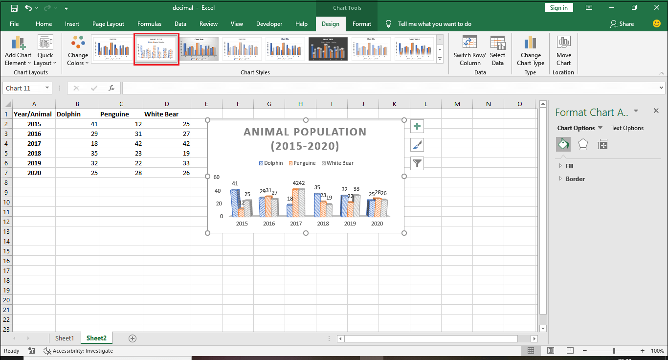
Note: The Chart Style option enables only when the chart inserted in your Excel sheet is selected. So, make sure chart is selected.
Step 16: You can now see the exact value is also showing for each bar in this chart.
Similarly, you can insert, create, and modify other charts in your Excel worksheet for your data.
Read a chart
You should learn how to read a chart to understand and analyze the data presented through it. It is most important to learn how to read a chart. A chart contains several components, such as elements and parts that help you to interpret the data.
This is one of the most important points because if you unable to read and understand the chart, you might misinterpret the value and analyze the data.


