Bridge Chart in Excel
What is Bridge Chart?
Bridge charts are very useful when you want to present different data broken down into component parts or show the cause and effect sequence as a sum of positive and negative effects. It does not matter whether you want to present the income statement broken down into main items, the number of products sold in a given period or a deviation from the plan – the use of a bridge chart will highlight the most important elements of the analysis, indicating whether a given element had a positive or negative impact on the final result.
How to insert Bridge Chart?
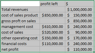
Enter dummy data like shown below.
Now you have to create a stack flow chart. To do this click on the “INSERT” tab then click on “Insert column chart” under the Charts group. Select Stack Column.
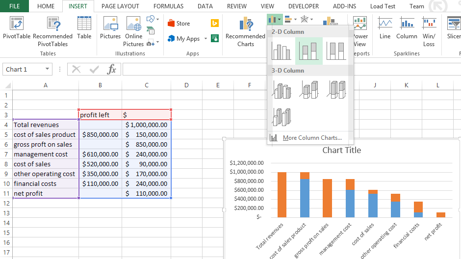
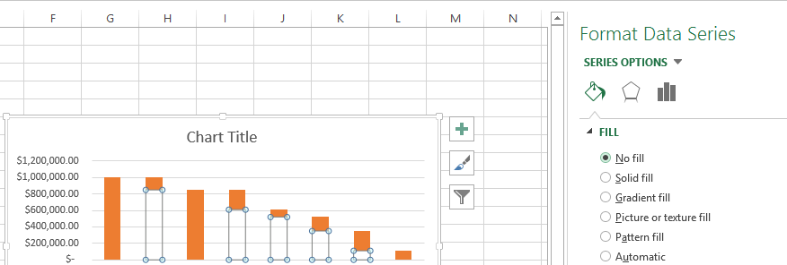
A chart has been created but it doesn’t look like a bridge chart, to change this right click on any one of the blue column (Excel will select all of the blue ones) and select “Format Data Series”. A dialog box appears, where select “No fill”.
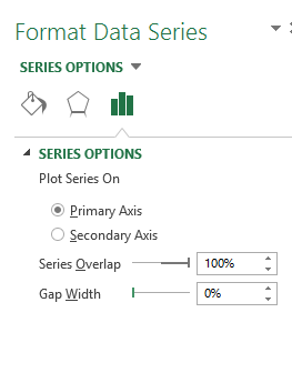
To look like a bridge chart on the same dialog box in the “Series Options” tick “Gap Width” 0% (“No Gap”).
For even more attractive graph format the column revenue and profits by setting fill in blue. Blue color for profits and red color for losses makes your chart easier to read. Better visualization will make your chart better for the person who will use that.
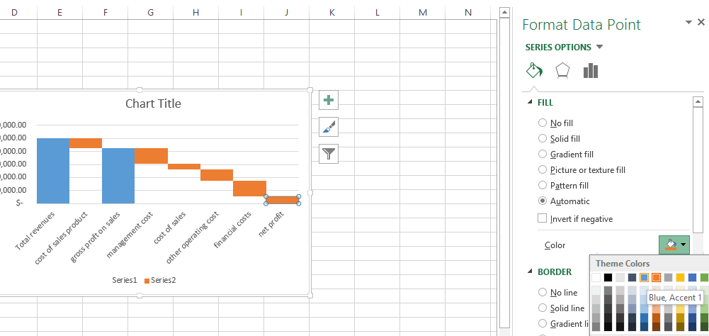
That’s it! Your bridge chart is now ready.
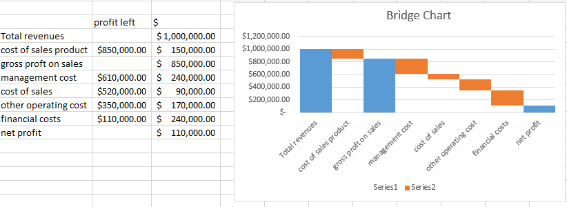
Thanks to the Bridge Chart you will be able to show the causes of effect eg. sales costs as a main part of general costs or mortgage installment as a big part of your household budget.
Template
Further reading:
How to calculate EMI?
Waterfall chart


