How To Create A Chart With A Baseline
When to use chart with a baseline?
You may need to use chart with a baseline to visualize fulfilling the goals, reaching the targets or for showing the sales results.
How to create a chart with a baseline?
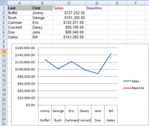
1. Consider the data and plot the chart from it.
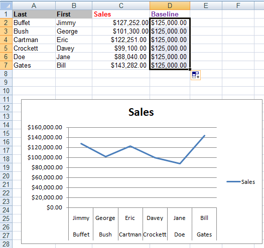
2. Enter the value of baseline in first row and drag it downward as shown below.
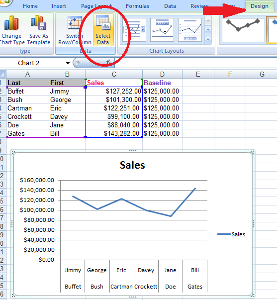
3. Select chart window, under design option choose Select Data option.
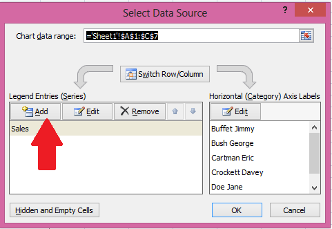
4. A window will appear like shown below. Click on Add option.
5. On selecting Add option a small window will appear. Set the Series name as Baseline and for Series values select the whole column of Baseline from data. Then press ok.
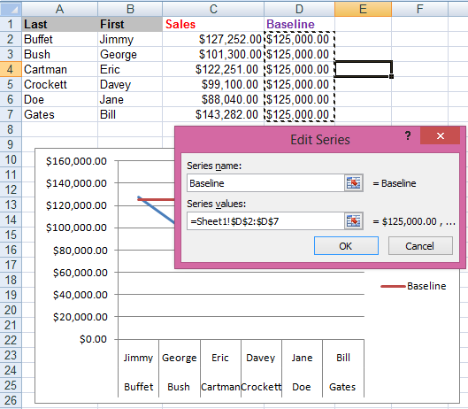
6. Now you will have a baseline on your chart window as shown below.
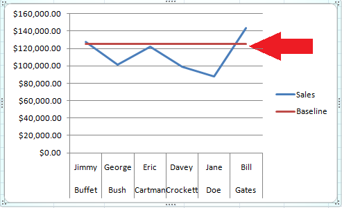
Your chart with a baseline is ready to use.
Template
You can download the Template here – Download
Further reading:
Basic concepts
Getting started with Excel
Cell References


