Chart with a goal line
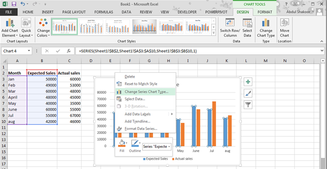
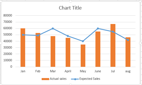
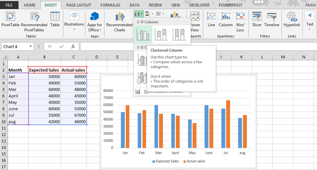 Now right click the blue bars, which are expected sales and select change series data chart type.
A dialog box will appear.
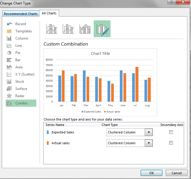
Change expected sales to chart type line with markers. Now click ok.
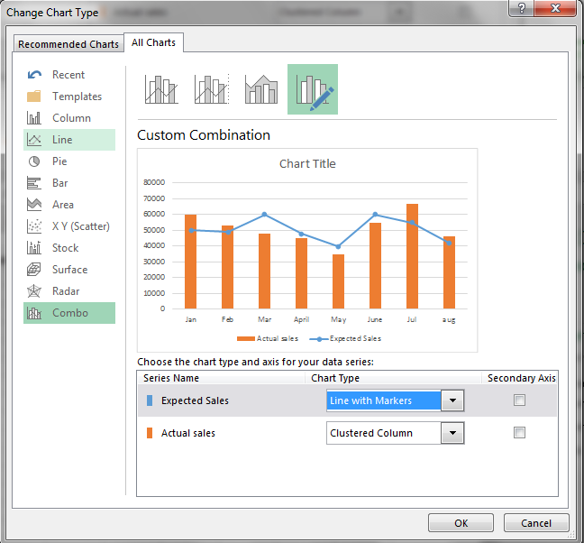
Final result will be like this:
Template
You can download the Template here – Download
Further reading:
Basic concepts
Getting started with Excel
Cell References


