How to add horizontal line to chart?
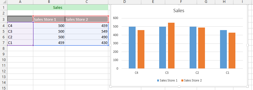 1. Add a new label to the data (1), and click on the cell under it to type =average(all the data with value) (2).
Note: This step is just a possible way to inform Excel what information to use for the line. You should repeat this step on all the remaining cells to match the rows of the remaining columns.
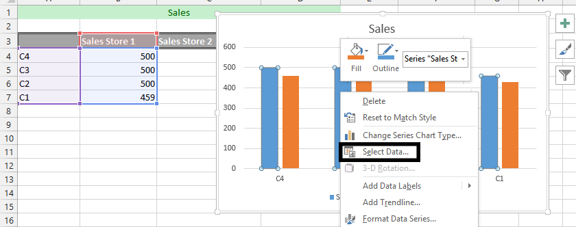
2. Right click on any of the series, and choose select data.
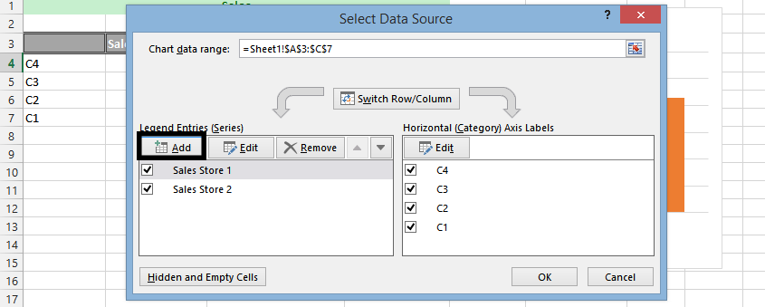
3. Click add
4. Choose the cell for series’ name (1), and cells for the values (2). Then click ok.

5. Press ok again.
6. Right click on any of the average series (1), and choose change chart (2).
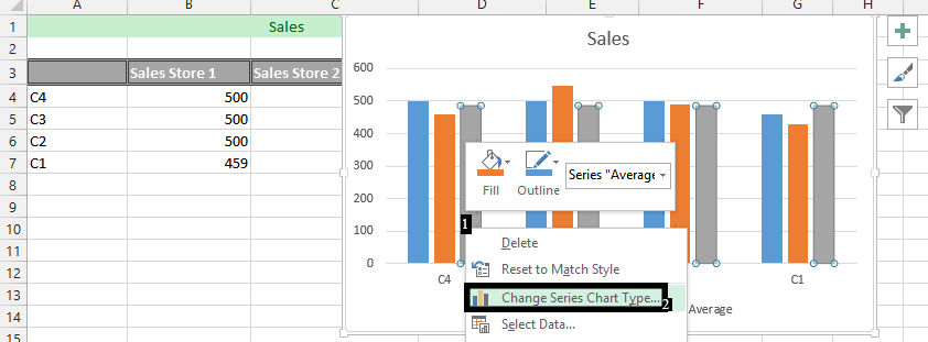
7. On the chart type, change the chart to line. Now, click ok.

The final result would look something like this:
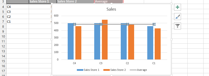
This is how to add horizontal line to chart. For further formatting you can format the line (change color or add description). This will help with your charts visibility.
Template
You can download the Template here – Download
Further reading:
Basic concepts
Getting started with Excel
Cell References


