Charts in Excel
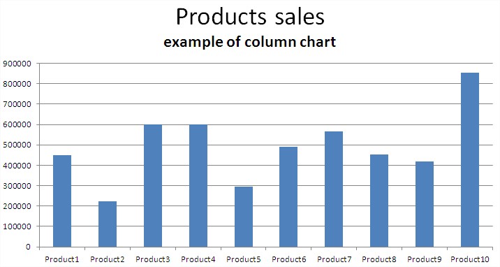
- Column chart – the most popular type of chart. The bigger value the higher column.
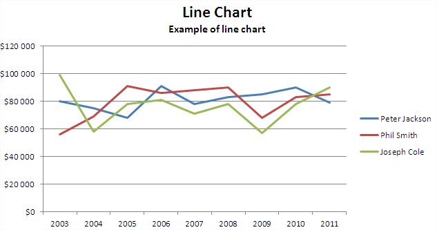
- Line – use this chart to show, how data change with the time. Use it to show 2 – 7 series of data. More looks not good.
- Pie – use it when you show data which are part of some whole. As an example surface, parts of sales.
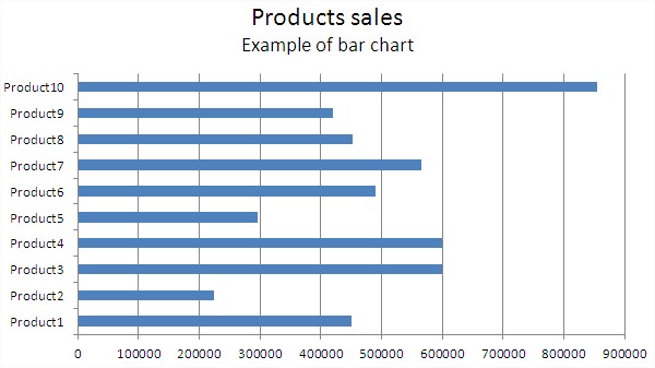
- Bar – good choice to show more than one category of data or one category with subcategories.
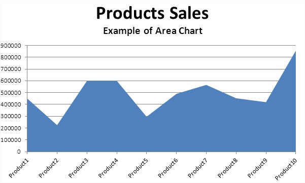
- Area – similar to line chart
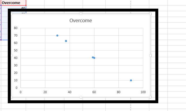
- Scatter – to show change value of data when you now values as a points.
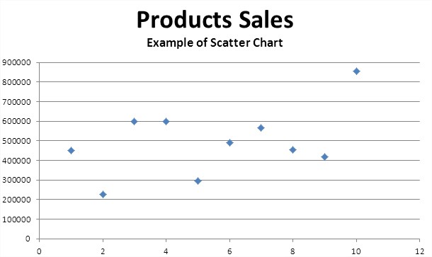
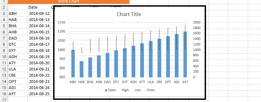
- Stock – only for investors
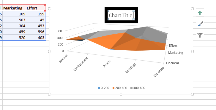
- Surface – when you show two sets of data
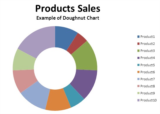
- Doughnut – similar to pie chart but can include few data series
- Bubble – it’s a kind of surface chart. Use it when you show three series of data. Bubble chart is often used for financial data to show difference between values.
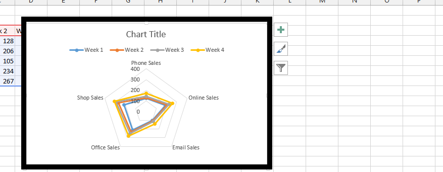
- Radar – a good way to display one or more variables for the two-dimensional diagram, wherein each arm presents another variable. The line connects all the data points from a spreadsheet along each arm.
That are basic charts which you can insert in Excel. There are much more types of charts. On this website you can find many lessons about charts in Excel. Not only basics.
Template
You can download the Template here – Download
Further reading:
Scatter Chart
Doghnout Chart


