Line Chart in Excel
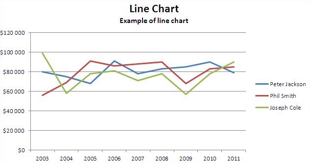
You can use line chart to show changes in trends over the time. In this case, we focus on sales. Prepare the necessary data in the table.

That’s like your chart will looks like:
Let’s learn step by step how to plot a line graph.
First select the sales data in 4th, 5th and 6th row.

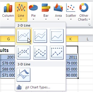
Second go to the ribbon. Here you find the Insert tab. Click the button Line to plot Line Graph.

From the drop-down menu select the first of the charts (2-D Line Chart).
You must improve this chart.
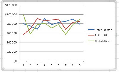
Let’s start by inserting the title. In the Layout tab, go to the Labels section and press the Chart Title (above chart).
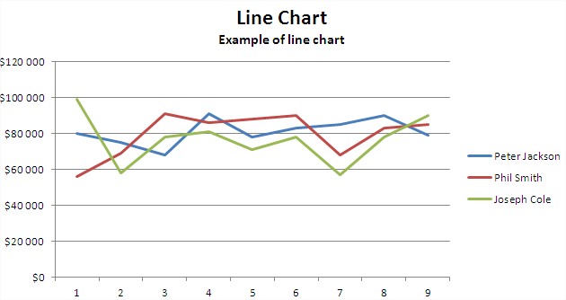
Let’s do something with Axis. Click on the data series, right-click and choose Select Data.
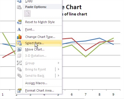
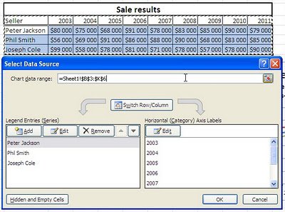
In the dialog box that appears, edit the horizontal axis labels. Then choose the range axis labels. Simply select the year from the table data. Now the data series in the chart now looks as it should.
Your line chart is ready.

If necessary, Excel allows us to next modify the chart. For example, you can change colors or add data labels. With such a chart prepared for any meeting of the board will not be terrible for you.
Template
Further reading:
Basic concepts
Getting started with Excel
Cell References


