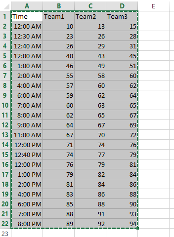
Chart with Hours
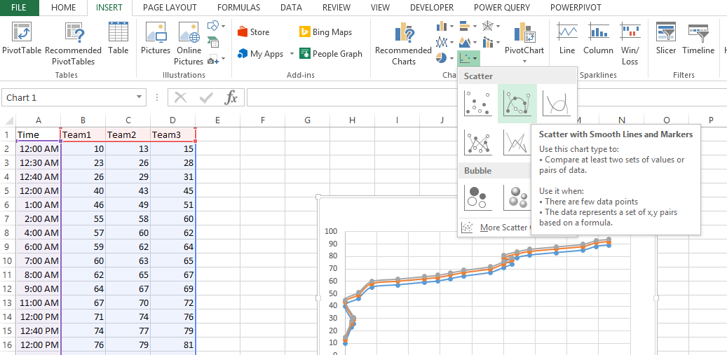
 Now lets start creating a xy scatter graph:
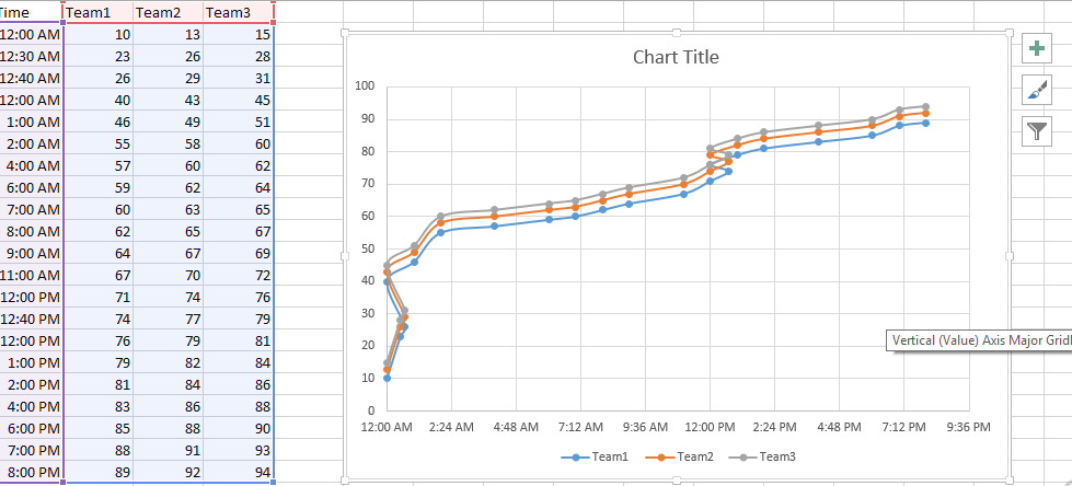
This is how the graph will look like:

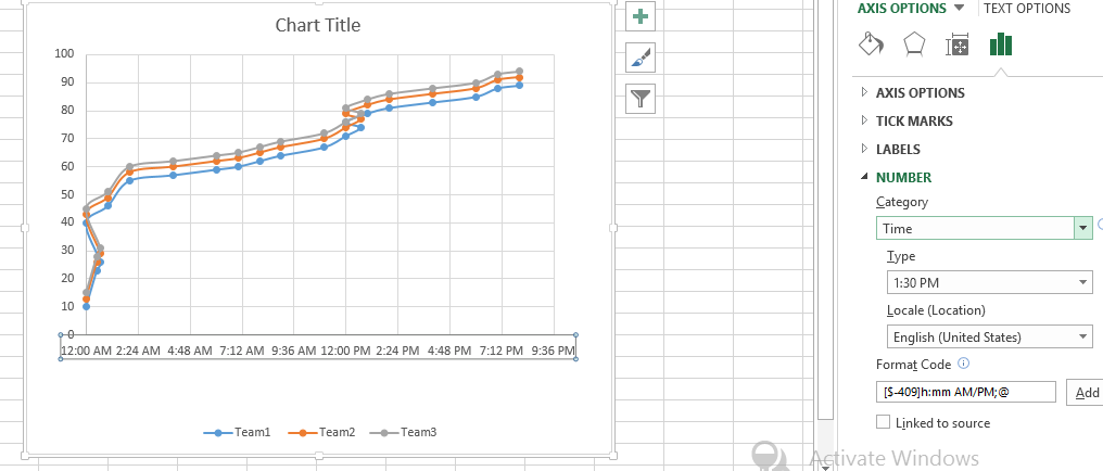
Adding dates to the data column A. Make sure Axis Type is set to Time Axis When you are creating a line, column or bar chart, Excel will automatically treat date data as a “Date axis”. This means that each data point will be plotted on the x-axis based on linear time, rather than equal distance from each other.
It will look like this now:

Chart with Hours is ready.
Template
You can download the Template here – Download
Further reading:
Basic concepts
Getting started with Excel
Cell References


