How to make a bar chart in Excel?
A bar chart is a graphical way of representation. Excel offers various charts to represent the data in a graphically manner. Bar charts are basically horizontal bars. When the data is complex and difficult to understand, use charts to represent it graphically. Charts make the data easy understandable.
Excel also allows to use the combination of two bars where bar chart can be combined with other Excel charts to represent the data. Bar charts are the horizontal version of column charts and this chapter will guide you to create and insert the bar chart.
When to use bar charts?
Bar charts are helpful to represent the Excel data and make them easy to understand. Excel users can use bar charts to represent the data when:
- They want to compare the values across categories.
- They want to display the duration through the chart.
- You can use a bar (horizontal) chart when text is long and difficult to display in the column chart.
Type of bar charts
In Microsoft Excel, you will see various bar charts. These Excel bar charts are categorized in two modes: 2D and 3D. These bar charts are –
2D bar charts
Following are the types of 2D bar charts, which are the two-dimensional representation of data.
- Cluster bar
- Stacked bar
- 100% Stacked bar
3D bar charts
Same bar charts are available in 3D mode. Following are the types of 3D bar chart, which are the three-dimensional representation of Excel data.
- 3D Cluster bar
- 3D Stacked bar
- 3D 100% Stacked bar
In this chapter, we will elaborate all 2D and 3D bar charts.
What can we do with chart?
You can perform various operations with Excel charts and customize them according to your data. You can provide the title to the chart and define labels and values to make the chart more understandable.
Look at some points of what we can do with Excel charts. These are very helpful while creating charts.
- Excel allows the users to create the chart for their Excel data.
- They can edit the default chart title of the chart and provide a heading according to the data.
- Excel users can also define the values (column headings) for horizontal bars.
- They can also define the labels (row headings) to each horizontal bar.
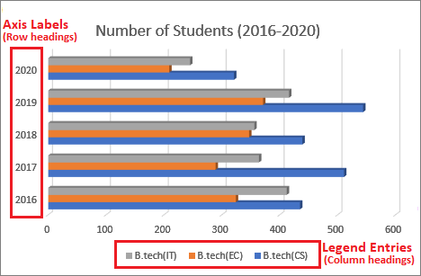
What a bar chart contains?
When you insert a chart in an Excel sheet, it contains three components: chart title, axis label, and legend entries. Each component indicates to the specific part of the Excel sheet data and is equally important to prepare an informative chart.
You can modify and set them according to your Excel data. By setting the values of all three components, you can make your chart more informative.
1. Chart title
Chart title is the heading of the chart that defines the purpose of creating the chart. When you insert a chart in an Excel sheet, it comes with a default heading, i.e., Chart Title. You can provide the chart title accordingly.
2. Axis label
Axis labels are usually referred to the row headings. They represent to the row’s headings that are selected to represent the data in a chart.
3. Legend entries
Legend entries are basically column headings. It means, legend entries represent Excel column headings that are selected to create the bar chart.
Graph
Graph is another component of the bar chart that contains the pieces of horizontal slides. Each horizontal bar slide is colored with a specific color to represent the specific data through pictorial representation.
Insert bar chart in Excel sheet
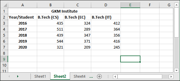
It is important to know how to insert a bar chart in an Excel sheet for data. Thus, we will show you the steps to create or insert a simple bar chart in Excel. We will create the following bar charts for the following dataset –
Method 1: Insert a 2D bar chart for Excel data
Method 2: Insert a 3D bar chart for Excel data
See these methods are described in detail with the step-by-step process.
Method 1: Insert a 2D bar chart for Excel data
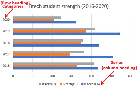
We have taken the data of number of students admitted for different branches of B.tech program from year 2016 to 2020. Following are some simple steps to insert a 2D bar chart for this specific data to analyze it visually.
Step 1: Here is the data for which we are going to create a 2D chart.
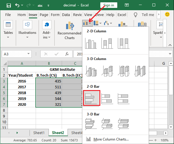
Step 2: Select the data excluding table header (row/column) and navigate to the Insert tab, where you will find a list of several charts.

You will get the Bar chart inside the column chart dropdown button.
Step 3: Click on the Column Chart or Bar Chart and choose a simple 2D bar chart from it. (We have chosen first one from 2D chart list.)
Step 4: The chart you have selected has been inserted to your Excel sheet. This chart is currently just containing horizontal bars without any info. We have to make it informative.
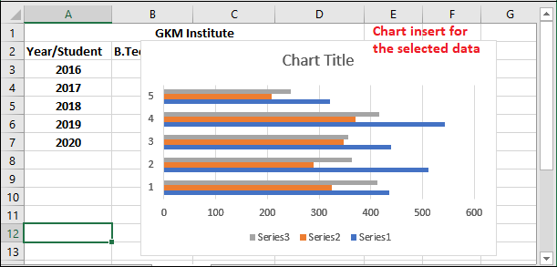
Tip: We can customize the chart so that the chart becomes more readable and also understandable.
Step 5: On the chart, click on the chart title heading and provide a reasonable chart heading to it.
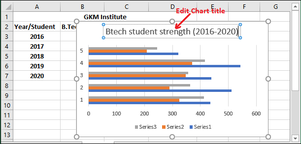
Step 6: You can also define the values and labels to bars. Here you see three colors bar each bar indicates to a specific data.
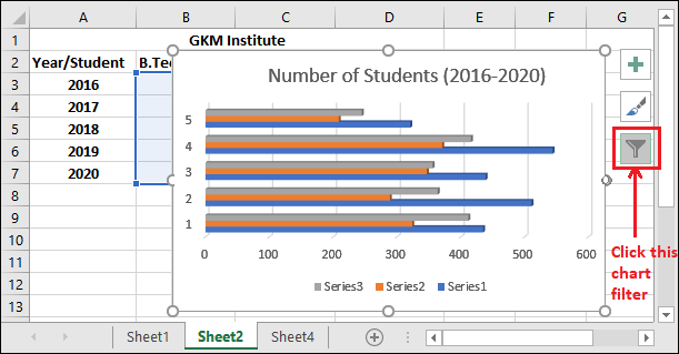
Step 7: Now, select the inserted chart and click the Chart Filter icon associated with it.
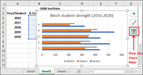
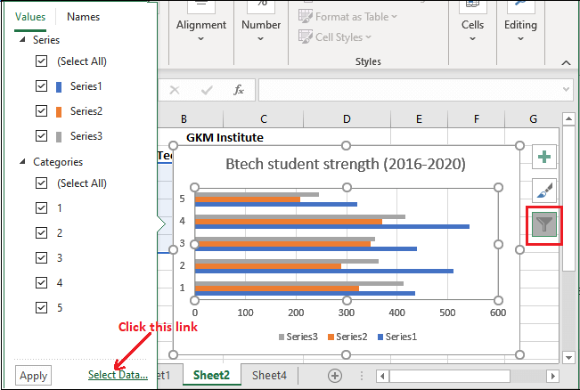
Step 8: Click the Select data? link present at the bottom right corner inside the Chart Filter list.
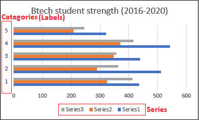
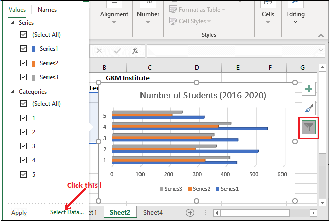
Provide the name to each bar one by one
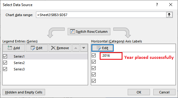
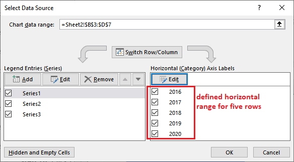
Step 9: Select the first number option 1 checkbox under the Horizontal Axis Label, then click Edit to rename it with the first row heading (year 2015).
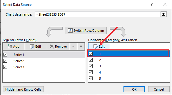
Horizontal categories represent to the row heading that indicates to the horizontally placed data inside the Excel sheet.
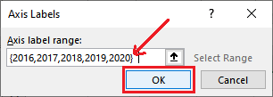
Step 10: Enter the year (2016) and click OK.
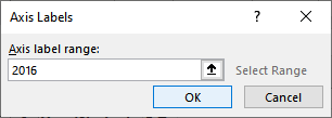
Step 11: The year you have entered will immediately reflect inside the Horizontal Axis Label list and on inserted chart for the first horizontal bar.
“It helps to provide name to each horizontal bar one by one. If you have too much horizontal bars in the chart, it will be good to provide the name to all bars at once.”
For this, use the following way:
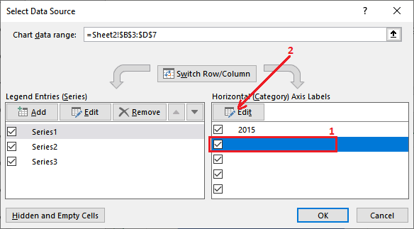
Provide the name to multiple bars at once
Step 12: To provide names to multiple bars at once, click the below checkbox under the Horizontal Axis Label and then click the Edit option.
Step 13: Write the values for each bar (from year 2016 to 2020) inside curly braces separated by a comma and click OK.
{2016,2017,2018,2019,2020}
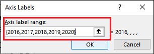
Step 14: You will see that all values are added and names to all bars have been provided in one go.

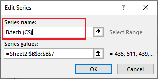
Step 15: Now, set the name for column heading from the Legend categories present on the left side on the same panel.
Select the first series (Series 1) and click the Edit button.
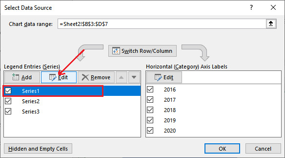
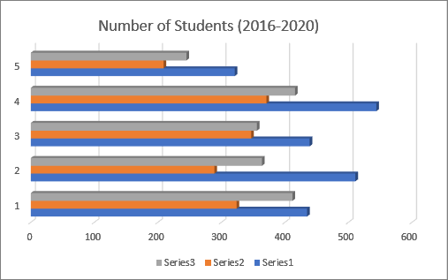
Step 16: Enter the first series name as B.tech (CS) for the first column and click OK.

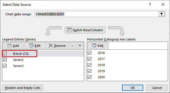
Step 17: See that the first series name (Series1) has been replaced with B.tech (CS). It will represent to a specific color bar (blue) in the bar chart.

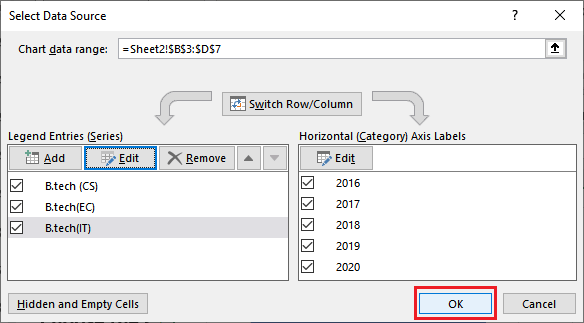
Now, repeat the same step for other series to replace the name (Series2 with B.tech (EC) and Series3 with B.tech (IT)).
Step 18: When all columns heading is replaced with Series (Legend Entries), click OK to save all the changes made here.

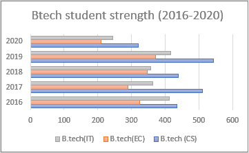
Step 19: All the changes are reflecting on the inserted chart. Now, the chart is much readable than before.
See the preview of 2D bar chart.
Choose the chart style
You are seeing the simple 2D bar chart containing almost all the necessary information. Additionally, you can make it more informative and attractive. Excel allows choosing different styles for the chart.
Step 1: Select the inserted chart and you will see that the different chart styles will enable inside the ribbon from which you can choose a chart style.
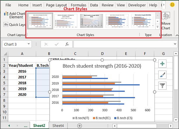
Step 2: Choose a chart style that will show additional information of data graphically. We have chosen Style 4.
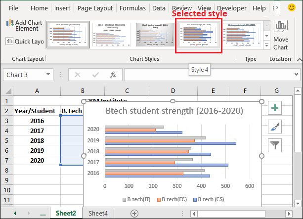
Step 3: It is looking different than the default chart. You can also choose another one that will show more detailed information of data through a chart than the default information.
Just like the bar chart, you can insert other charts.
Choose a different chart color
You can also change the color of the horizontal bars inserted in bar charts to make the chart attractive and easy to visualize.
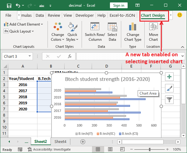
Step 1: To change the color of bars inside the chart, you have to first select the chart that will open a new tab on selecting the chart.
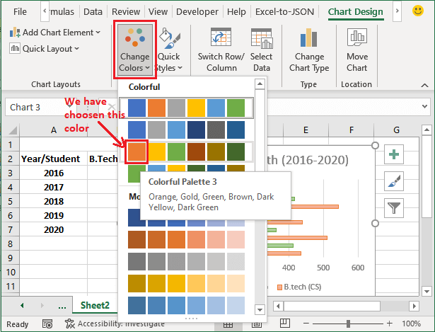
Step 2: In this tab, click the Change color dropdown button and choose a color that you feel look good in Excel chart. We have chosen yellow color.
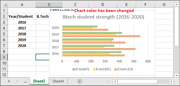
Step 3: See that the color of the bars has been changed.
The chart we have designed is the fully customize 2D bar chart created for the specified chart.
Method 2: Insert a 3D bar chart
Following are the simple steps to insert a 3D bar chart for some specific Excel data.
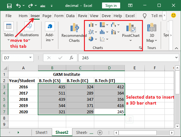
Step 1: We will use the same data that is used for the 2D bar chart to create a 3D bar chart.
Here, select the data along both table heading and navigate to the Insert tab, where you will find a list of several charts.
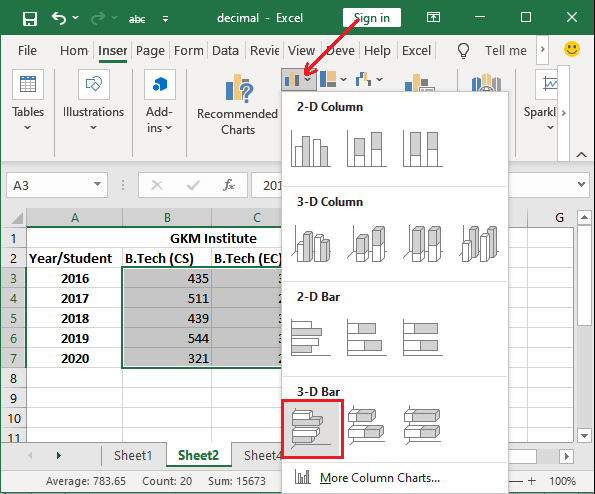
Step 2: Click on the Bar Chart and choose a 3D bar chart from it. (We have chosen first one from 3D chart list.)
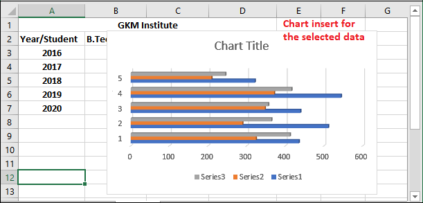
Step 3: The chart you have selected has been inserted into your Excel sheet. This chart is currently just containing only horizontal bars without any info. We have to make it informative.
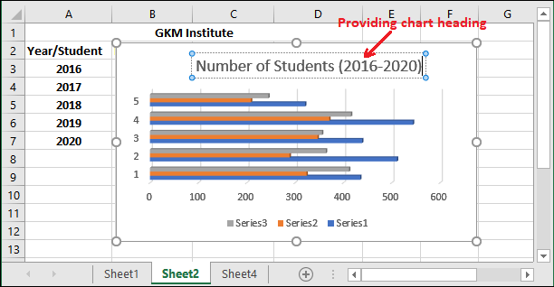
Step 4: On the chart, click the chart title heading and provide a chart heading to it.
Step 5: You can also define the values and labels to bars. Here you see five groups of three colors, where each bar and group of bar indicate to specific data.
Step 6: Now, select the inserted 3D chart and click the Chart Filter icon associated with it.
Step 7: Click the Select data? link present at bottom right corner inside the Chart Filter list.
Step 8: Select the first checkbox under the Horizontal Axis Label, then click Edit to rename the row headings.

This time, we will provide the categories name at once instead of one by one.
Step 9: Write the values for each bar (from year 2016 to 2020) inside curly braces separated by a comma and click OK.
{2016,2017,2018,2019,2020}
Step 10: The year you have entered will immediately reflect in the Horizontal Axis Label list and on inserted chart for all five horizontal bars.
They will add all the provided values at once.
Step 11: Now, provide the column headers inside the Legend Entries present on the left side. For this, select the first checkbox Series1 and then click the Edit button.

Step 12: You will see that all values are added and names to all bars have been provided in one go.
Step 13: See that the first series name (Series1) has been replaced with B.tech (CS). It will represent to a specific color (blue) in the bar chart.
Now, repeat the same step for other series to replace the name (Series2 with B.tech (EC) and Series3 with B.tech (IT)).
Step 14: When all row and column headings are replaced with Series (Legend Entries), click OK to save all the changes made here.
Step 15: You can see that all the changes are also reflecting on the inserted chart. Now, the chart is much readable than before.
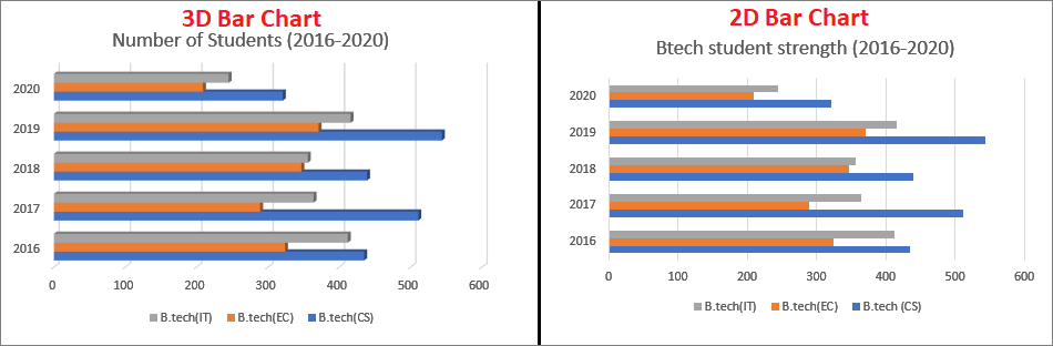
See the preview of the 3D bar chart. This 3D chart looks different compared to the 2D bar chart.
Visual difference between 2D and 3D bar chart
Clustered bar chart
Clustered bar charts are helpful to compare the values across the few categories. This cluster chart is available in two formats: 2D clustered chart and 3D clustered chart.
The main difference between both 2D and 3D clustered chart is -2D clustered charts shows the bars in 2-dimensional perspective and also use a third value axis. While 3D clustered chart shows the bars in 3-dimentional perspective. But just like the 2D clustered chart, it does not use a depth axis (third value axis).
When use clustered bar chart
Use clustered bar charts –
- When the category text is long.
- When it shows duration.
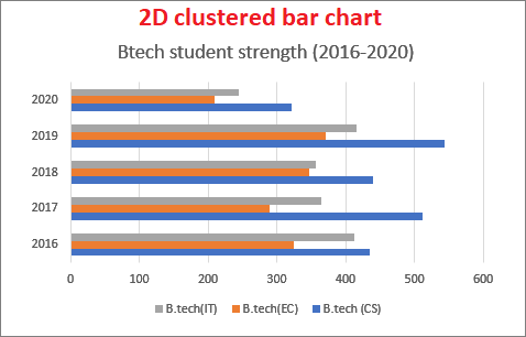
2D Clustered chart
Following is the 2D clustered chart –
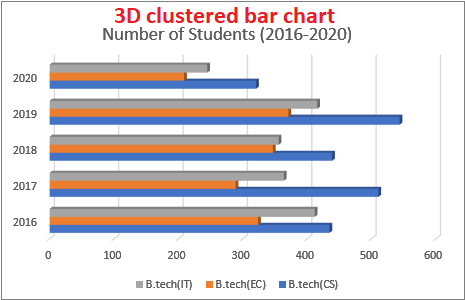
3D Clustered chart
Following is the 3D clustered chart –
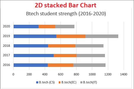
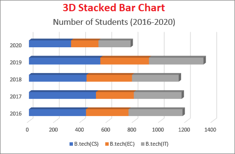
Stacked bar chart
A stacked bar chart is different from the other bar charts but used for the same purpose: to represent the data. It shows the Excel data in horizontal bars where each bar is divided into stacks that better represent the data graphically. These stacked bars compare the parts of the whole data in the form of stacks across various categories.
Similar to the cluster bar chart, it also has two formats, i.e., 2D stacked bar chart and 3D stacked bar chart. A 2D stacked bar chart represents the Excel values in 2- dimensional horizontal rectangles. Whereas, 3D stacked bar chart represents the data in a 3-dimensional perspective, which does not use the depth axis.
When use a stacked bar chart
A stacked chart can be used when the category text is long. It divides the large data representation into stacks.
2D Stacked chart
Following is the 2D stacked chart –
3D Stacked chart
Following is the 3D stacked chart –
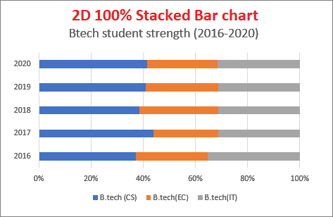
100% Stacked bar chart
100% stacked bar chart is an additional chart of stacked bar chart, which offers additional data representation. Using the 100% stacked bar chart, you can also see the contribution of each value in percentage along with stack representation.
With the help of this chart, an Excel user can compare the percentage for each value and these percentage changes whenever there is any change in Excel values with respect to time.
Almost all bar charts have is defined in two formats: 2D 100% stacked chart and 3D 100% stacked chart
When use 100% stacked bar chart
100% Stacked chart can be used when the category text is long. There is a bit of representation difference of it than the simple stacked bar chart. It divides the large data representation into stacks.
2D 100% Stacked chart
Following is the 2D 100% stacked chart –
3D 100% Stacked chart
Following is the 3D 100% stacked chart –