Slope Graph Chart In Excel
Slope Graph could be useful for you when you need to show the data which increase (of decrease) in time.
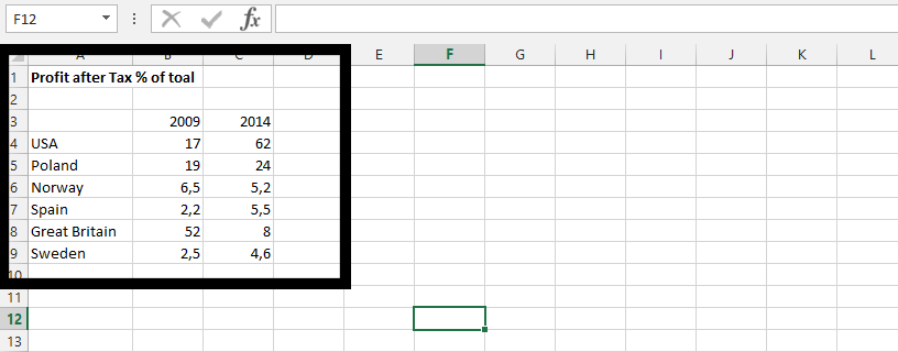
To create Slope Graph in Excel you need to layout your data first.
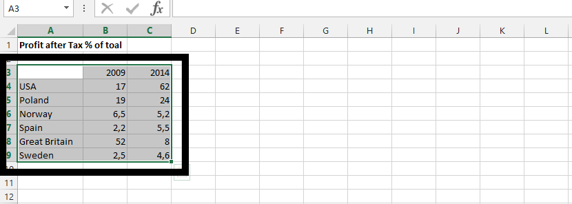
Select the data.
Click insert (1), and click on line chart (2).

Click on Design tab (1), and Switch Row/Column (2)

On design tab (1), click on Quick Layout (2), and choose layout (3).

Click on the lines (1), and delete it.
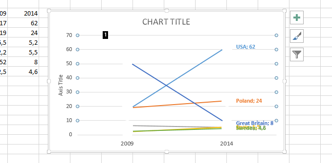
Click on y axis (1), and press delete on keyboard. Repeat the step with axis title showing beside the y axis, and chart title.
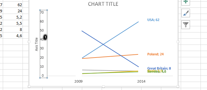
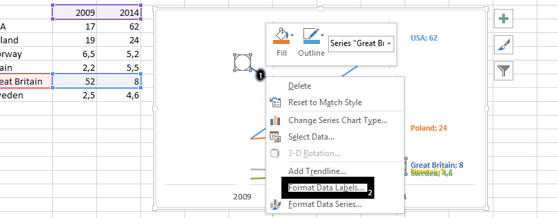
Right click on one of the series (1), and click on format data labels (2).
Click on label options (1), chart symbol (2), label options (3), and all you need to do is check value (4).
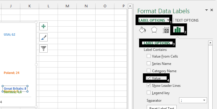
Note: Show leader Lines is already marked. You should leave it like that.
Double click on data label that are overlapping or need to be moved to create space for overlapping values (1), and move it so all labels and value shows.

Click on all the soft edges (1), and press delete on your keyboard.

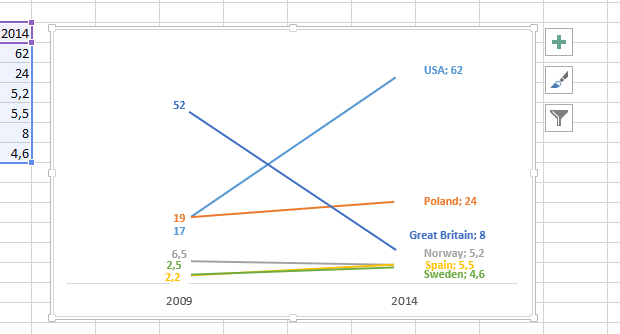
Your Slope graph chart will look like this:
Template
Further reading:
Basic concepts
Getting started with Excel
Cell References


