

What’s new in Excel 2013?
Start Screen
With the start screen, your work will be done faster as all files you are working on will be located on one screen. The most recently used worksheet can be pinned on the recent list for easy access. Through the start screen you can open other files located on the disk. There is also a list of templates that can help you easily start a project. You are at liberty to enable or disable the start screen. But I find it very useful to keep it available for use.

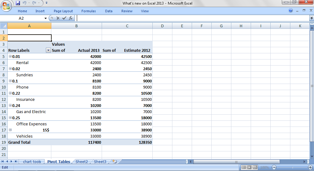
Pivot Tables that make things simpler
Pivot tables are important tools that help users analyze and answer questions about the data they are working on. But new users find this tool difficult to create. However, the new 2013 recommended pivot tables have made things easier as users can work with tables and charts with a simple click of the mouse.
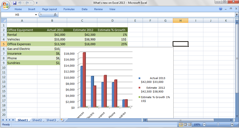
Recommended Charts
Recommended charts help you simplify choices when working on your spreadsheet. It shows only a fraction of charts that are relevant to the selected data. This is very useful for new users because it will enable them explain data to the viewers without confusing them. To make use of this tool, click on the data, go to the insert tab, and click on recommended charts. This will bring out a dialogue box that shows you how your data will look when you plot the chart. Pick the appropriate option and your chart is automatically created.
Excellent tool for data analysis
The quick data analysis tool will help both the inexperienced and experienced users to select different options when working with data. To make use of this feature, select the data you want to analyze and click the quick analysis icon that shows up at the bottom right corner of the data selected. A variety of analyzing tools such as Sparklines, Tables, Totals, Charts, and Formatting, will appear, allowing you to scroll over the choices to pick the most appropriate option, depending on what you are working on. Click the right option you wish to analyze. The feature will hasten the process by writing, charting, and formatting formulas.

New Backstage View
The backstage feature view was first introduced in the 2010 version of office word. But it has been completely moderated to show you exactly the project you are working on so you can select the right task. With the open tab, you now have access to workbooks that were recently accessed. The backstage view also gives you the chance to use your SKyDrive account and helps you set up extra Sharepoints or SkyDrive accounts.
More efficient Chart tools
In earlier Excel versions, when selecting a chart, it usually shows additional tabs: Format, Layout, and Design. However, the interface is more simplified in 2013, with only the format and design tabs to choose from. When the chart is selected, some icons show-up at the edge of the chart. You will have to click one of these buttons (chart filters, chart styles, or chart elements) to reveal more chart options. The 2013 chart also allows you to change the color or style of the chart. See Screenshot below:
Template
Further reading:
What's new in Excel 2007?
Basic concepts
Getting started with Excel
Cell References


