Histogram Chart in Excel
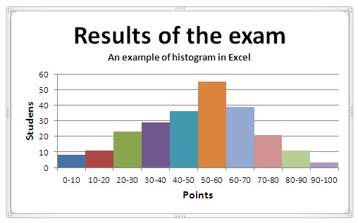 You can learn what are the rules for creating a histogram and how to create a histogram in Excel. For starters you need a table of data. Let it be, that you analize results of the exam. An example table is:
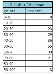
The main principles to create a histogram:
- data should be divided into equal intervals
- number of compartments should be 5 -15 so that the histogram was clear
- frequency in any of the intervals should not be equal to 0
- between the columns is not to be gaps
Creating a histogram in Excel is very simple. First, based on the data table you create a column chart. First delete the legend, it will not be needed.
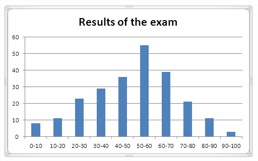
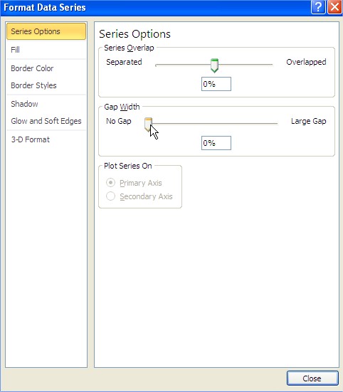
Then you remove the spaces between the columns. Just right click on the column and choose ‘Format Data Series’. A dialog box appears, where you choose ‘No gap’.
The most important steps you have already completed. Histogram have to be improved. Depending on your vision, you can choose the right colors to increase transparency. One possibility is the chart styles. In addition, you must add the data series. The finished sample histogram looks like this:

The results of the examination is of course only an example. You can also use histogram to illustrate population demographics and broad capabilities in quality control.
Template
Further reading:
Basic concepts
Getting started with Excel
Cell References


