Interactive Map Dashboard in Excel
Gathering the Resources
Microsoft Corporation has an add-in. You can download it with this: http://www.microsoft.com/en-us/download/details.aspx?id=39379 by clicking on the download button.

Go to this and then press download: http://www.microsoft.com/en-us/download/details.aspx?id=38395

You should click on the File tab that is on the top of the Microsoft Excel, and then choose Options.

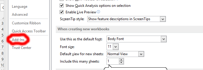
Click on Add-Ins, which is marked in red.

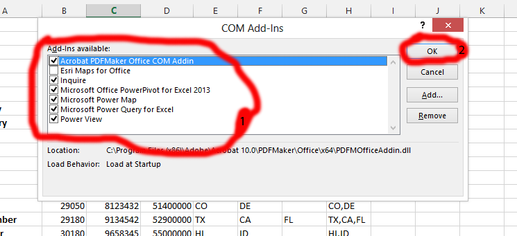
When you clicked on the Add-ins, the whole thing would close, and Excel Options will show. You should go to the low side of the option window, and see the Manage, where you would click on the COM Add-Ins, which is marked as number 1. And then click on Go…, which is marked as number 2.

Click on the boxes beside Microsoft Office PowerPivot for Excel 2013, Microsoft Power Map, and Microsoft Power Query for Excel, and Power View, which are marked in red, and labeled as number 1. Further, you should click on ok. This is marked in red, and labeled as number 2.

Tip: If you don’t see the PowerPivot, Power Map, Power Query, or Power View, you should insert your installation CD or downloaded file for Microsoft Office, and choose “add or remove features” when the installation windows shows, just add all the features in the installation CD.
Getting the Raw Data
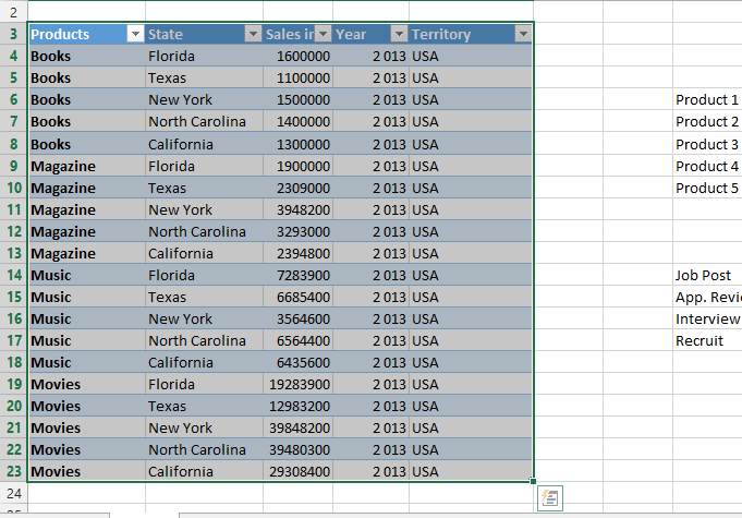
It is best to first determine what you would like to analyze in the interactive map dashboard. What knowledge you would like to gain. This is your choice. We have chosen to know how well products are selling in specific areas in USA.

Provide relevant information. The details should be laid out clearly. Getting the relevant data is about placing yourself in the project that the map is about. What happened, where did it happen, and other things that are relevant for you to achieve your goal.
Map Creation
Click on the Insert tab, which is labeled as number 1, and then choose Table which is number 2. Then select the data range, and if your data has a header box, you should also check it, to make sure that the table is successfully created.

With the data copied, you should select the Insert tab (labeled number 1), and then click on Power View, which is labeled as number 2.

Click on the Design tab, which is the number 1, and then click on Map, which is the number 2.

Select necessary fields for the map. I would suggest just the state/region to make it easier for your map interaction.

Making Adjustments
Click on the Layout, and make desired adjustments. You could add the title, legend, label the data, and even give the map a background.

Click on any of the blank part, where you would like to create filler, which would be slicer for the interacting map dashboard.
Select two things you find necessary for the information you need. In this case, we are clicking on sales and state, because we want to know how our products is selling in each state.

Following previous step would enable you to see Design tab. Choose the chart of your choice in the area marked in red. It can be bar chart, column chart, or other chart. It is about choosing the right chart for you.

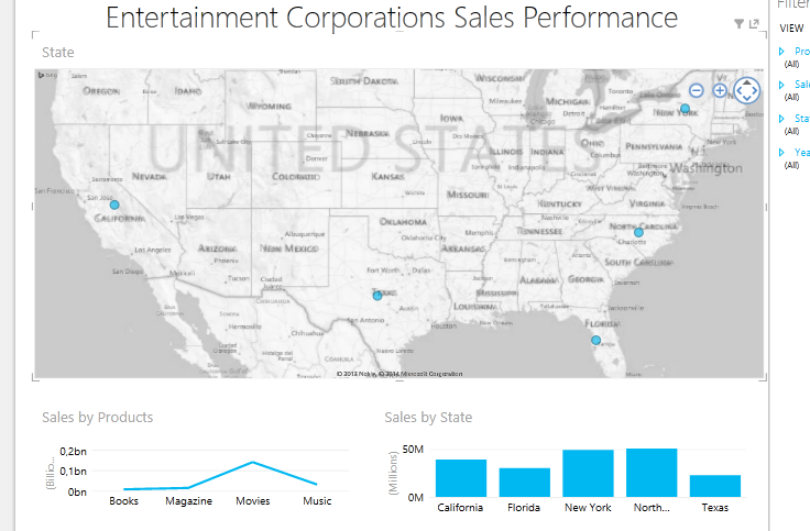
You can now see the new chart, and if you click on a new location showing in the map, you would see it interacting with the created charts.

The Map Interaction would look like this:


