

Chart with upper and lower control limits
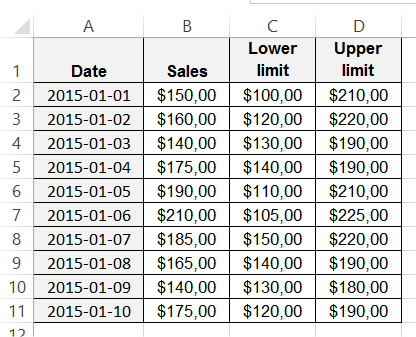 Highlight data table. Go to the ribbon to the Insert tab. Choose a Line chart.
Your chart should like similar to this one.

Right click first lower limit line and choose Format Data Series from the menu.

Change line color to red and set width to 5 pts.

Do the same for upper limit line. Change chart title. Your chart with upper and lower control limits is ready.

Template
You can download the Template here – Download
Further reading:
Chart that Ignores N/A! Errors and Empty Values
Chart with a goal line


