

Covid Analysis In Excel
Load Covid data to Excel
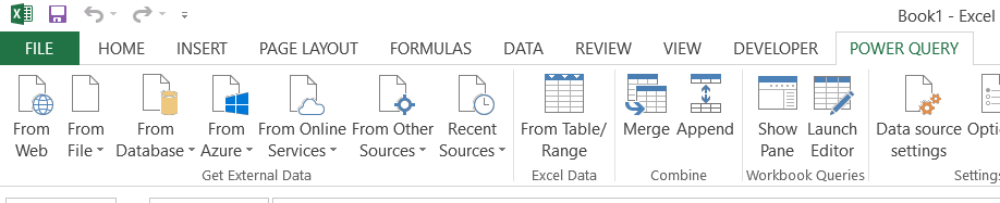
First you need the data. To get one go to the Excel ribbon to the Power Query tab.
Note: If you don't have Power Query tab first check this Power Query article.
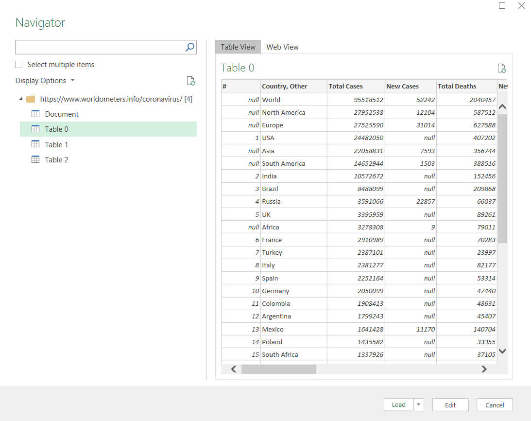
Next click From Web to get the data. Choose the data source here.

Choose Table0 and see the Table view. At this point you can Edit the data (eg. remove columns you don’t need) or Load data to your spreadsheet.
After that step Covid data will be imported to your Excel sheet and you will be able to perform your Covid analysis.
Covid data analysis in Excel
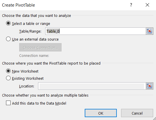
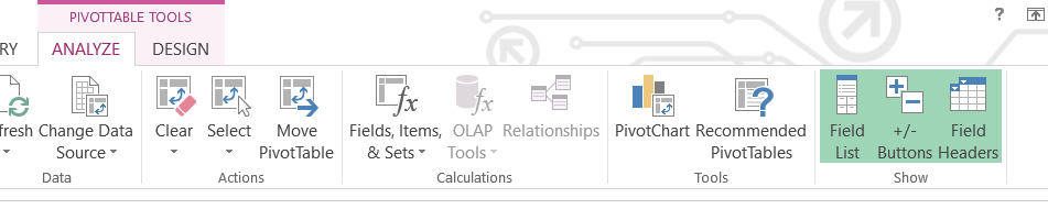
In most cases you may want to create Pivot table from coronavirus data you just loaded to your Sheet. For sure you have noticed that the new Table Tools menu appeared in your ribbon. To create Covid Pivot Table go to ribbon and click Summarize with Pivot Table button.
From the window choose where you would prefer to create the table.
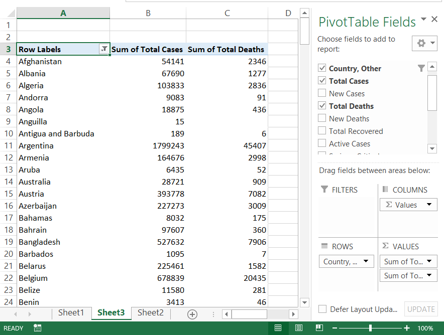
Empty Pivot Table has been created. Now you may need to select what kind of data you need here. I prepared the simplest data set which you can see in the picture. For rows I selected countries and in columns I have sums of coronavirus Total cases and Total deaths.
Covid Chart
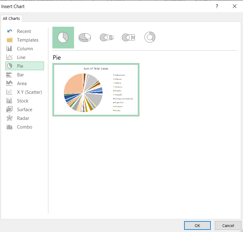
After preparing your coronavirus analysis in Excel you may need to visualize it. Perfect solution for that is to insert Pivot Chart based on Pivot Table. To do that just click Pivot Chart ribbon button.
In the next window just choose the type of the Excel chart you would like to insert. I’ve prepared Pie Pivot Chart.
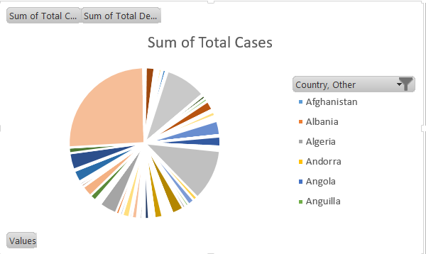
This is how the Covid chart looks like in Excel.
Template
Further reading:
Basic concepts
Getting started with Excel
Cell References

The number of possibilities is infinite. The lessons you might be interested:

Analyze Covid Data over time

Display Data as Percentage of Total in Pivot Table

Filtering top 10 pivot table values

Covid cases/deaths future estimation

Sorting coronavirus data

Inserting two types of chart in the one chart


